Among the most popular tools used by registered reps are Callan Charts, or the Periodic Table of Investment Returns. A staple of fund wholesalers and advisors alike, they are used to graphically illustrate to financial consumers the need to diversify and the impossibility of market timing. Yet upon closer inspection, the charts seem to provide a guide to better returns with less risk than the equally weighted asset allocation portfolios they are so often used to promote. The difference is all in the assumptions made.
It's a rare financial professional who has not seen a Callan chart. Also referred to as a Periodic Table of Investment Returns, the Chart harkens us back to the periodic table that used to adorn every science classroom in our high school days.
The classic Callan chart has rows and columns of multi-colored boxes resembling a crazy patchwork quilt drawn from all the colors of the rainbow. In the example below, each of its 20 columns represents one of the last 20 years. Within each column are boxes, each colored a unique hue to represent a given index and each containing the annual return of that index. Finally, the eight rows in each column rank the colored boxes in order of their performance for each column year.
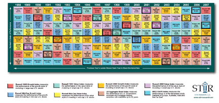
The index with the best performance of the year is on top, and the ranking continues in descending return order, with the worst ranked index at the bottom.
Callan Associates first developed the Periodic Table of Investment Returns in 1999, with a look back over the previous 20 years (1979-1998). Since that time, Callan charts and the numerous fund company clones have become a staple of fund marketing materials.
Companies ranging from giants Fidelity, MFS, Oppenheimer, Prudential and Vanguard, to smaller fund families like Frontier, Pacific Life and Brandes, include the charts as a prominent part of their marketing arsenal. At last year's Schwab Impact meeting one could collect copies of them from at least 15 different fund families. Some fund families focused on displaying the returns of indexes, but many simply boxed and ranked the yearly returns of their various funds.
At that same meeting, BlackRock showcased its new website tool that allows advisors to create customized periodic charts. Choosing from more than 100 indexes, one can create a chart featuring a maximum of ten indexes spanning a period of up to 20 years. It's all done in minutes (http://www1.blackrock.com/).
A quick Google search further discloses that the Callan charts have found their way onto many advisors' own websites, as well. For a simple graphic presentation to have continued to grow in popularity for so many years, financial professionals must continue to find it to be very useful.
Reading the advertising copy accompanying the charts created by the various companies discloses two principle points that the charts have traditionally been used to convey. Fidelity's 2007 version of the chart sums them up best: "This chart demonstrates both the potential benefit of diversification and why it may be a mistake to try to time the market."
Fidelity's rival, Vanguard, states the diversification argument as well: "Diversification among stock funds makes good sense. Stock index returns can change dramatically each year. Diversification can smooth out peaks and valleys, and help you avoid unnecessary risk."
The argument questioning market timing is made repeatedly in the various charts: "From year to year there's no telling which asset classes will be the best performers..." (Allianz); "Everyone wants to be in the best performing asset class every year. The thing is, few people, are savvy enough to choose the best consistently." (MFS); and "...the effectiveness of a 'buy-and-hold' strategy comes through in the overall fluctuation - a bad year for any given asset class can follow several years of strong performance, just as surely as a recovery can follow a downturn." (Frontier).
Few would quarrel with the benefits of diversification as set out in the first argument. It does reduce risk in exchange for an average rate of return (the mean return of the asset classes held). As we will see, however, one need not hold all the available asset classes to get the risk reduction benefits of diversification.
As to the "anti-market timing" argument, the Callan chart fails to be supportive. First, the chart clearly demonstrates the danger of holding any one asset exclusively throughout the time period shown - regardless of which company's chart is chosen. No asset class is in the top spot every year. A buy and hold approach to any assert class appears dangerous - suggesting a need for, and an inviting target for, investment timing.
The conflict between what appears obvious in viewing the charts and the funds' anti-timing message is a matter of how the data is manipulated.
The following anti-market timing argument is provided in the 2007 charts of Fidelity and Putnam. Similar versions have been used in other fund materials:
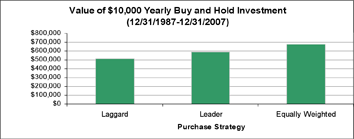
The chart below reflects the 20-year period shown on the Periodic chart from 12/31/87 to 12/31/07.
The first bar is a hypothetical investment of $10,000 at the beginning of each year into the worst performing index of the previous year.
The second bar illustrates a hypothetical investment of $10,000 at the beginning of each year into the best performing index of the previous year.
The third bar illustrates a hypothetical $10,000 investment at the beginning of each year, equally allocated among all the indices.
By spreading investments over all of the asset classes, the hypothetical investor would have accrued $676,510. That's $165,047 more than if this investor had chased the lowest-returning index and $88,537 more than if he or she had chased the highest-returning index. The results look like this:
Looks pretty definitive, doesn't it? And the fallacy of the argument is very difficult for most financial professionals, let alone clients, to detect.
On showing the chart to many advisors, all expressed universal belief about these examples. They all thought that, in testing the "Chasing the Winners" approach, one bought last year's winner, held it a year, sold it and bought the New Year's winner, and so on. With the popularity of rotation strategies, it's a logical assumption.
In reality, these examples illustrate the weakness of buy and hold investing arguments. They assume the $10,000 investment each year is NEVER sold. As always, in analyzing statistics, understanding the assumptions is critical. Charts using this illustration state that they assume a $10,000 investment in last year's winner. What is unstated is when they sell. And the reason why it is not stated is because ... they never sell. The only way the values shown in the illustrations can be achieved is to hold on to every investment once purchased until the end of the study.
Here's an example of how it works: $10,000 is invested in the 1990 winner (bonds on the periodic chart) at the beginning of 1991 and that investment is held until the end of the study - 12/31/07. That means it was held in 2002 when bonds again topped the chart, but it was also still held in 1995, 1996, 2005 and 2006 when bonds were the worst performing asset class. It was held for seventeen years, even though 1991's new leader (small cap growth) was available to substitute for bonds in 1992. This investment process was repeated each subsequent year - $10,000 invested in each year's winner and held ... forever!
Given this restrictive no-sale assumption, totaling the investment performance of these $10,000 yearly purchases does not prove that "...it may be a mistake to try to time the market..." It merely demonstrates that return persistence does not continue forever. In addition, what these "proofs" really demonstrate is that buy and hold - even when employed in a strategy that purchases the right asset at the right time - doesn't work if you don't sell that asset at the right time.
In any event, it is likely that most investors would assume that a leader one year should not be held forever, but should instead be sold periodically to make room for the new leader. How would such a strategy employed annually compare in the test posed above? Here are the results for the 1988-2007 period, using the values from the same chart.
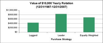
In contrast to the typical periodic chart commentary and most conventional wisdom, we see that following the market winners can be a very profitable strategy... if one sells each year and buys the new market winner! The market winner approach improved on the market laggard (the previous year's greatest loser) performance by 90% and topped the equally weighted asset allocation by more than 20%.
The difference is more dramatic if the full $100,000 is invested at the start of the strategy rather than in $10,000 yearly increments.
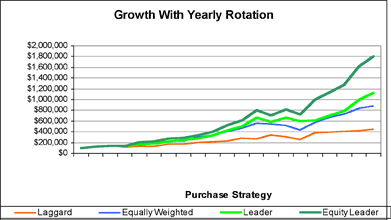
The superior performance is illustrated throughout the period. Buying the last year's leader more than doubles (149%) the laggard performance, while still exceeding the performance of the equally weighted portfolio by better than 28%.
The chart above also tracks a fourth investment option, this time buying into the best equity index (excluding bonds). This proves to be the best strategy, doing well even through the 2000-2002 bear market. If we examine the performance of each of the four strategies during that bear market period, we find that while the top performance was by the Laggard strategy, all three of the rotation-based strategies beat a buy and hold investment in an equally weighted portfolio.

The results of an "Equity Only" strategy also illustrate that one can use the concept of following market strength to fashion other effective strategies. An independent research firm, STIR RESEARCH LLC, for example, has expanded the concept to create a Market Leaders Index. Tracking the top four six-month equity leaders over the same period as the charts above captures much of the equity-only appreciation and adds diversification to the strategy (www.stirresearch.net).
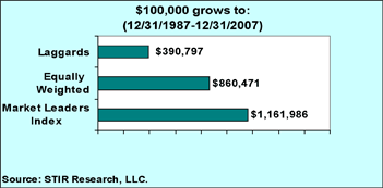
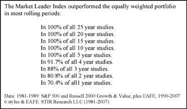
Over the last 29 years, this strategy has been remarkably consistent. Tracking rolling periods throughout the 1981-2007 period, the Index outperformed the equally weighted asset allocation portfolio most of the time:
The risk characteristics of the Market Leaders Index versus the equally weighted asset allocation portfolio also calls into question the assertions by the various chart promulgators that an equally weighted or asset allocated portfolio is the preferred way to achieve diversification to "avoid unnecessary market risk." Here's how they compare:
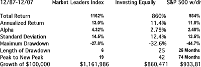
Why does this work? Proponents of the efficient market theory would say that it can't or that the superior returns must be explained away by increased risk. Yet, as the above statistics show, while there is an increase in standard deviation, the risk adjusted return as measured by alpha actually increases. This suggests that while upside volatility (returns) are higher, downside risk is less. The maximum drawdown statistics support this interpretation.
Furthermore, an overwhelming number of academic studies have come to a conclusion different from the efficient market advocates. For example, Yin-Ching Jan and Mao-Wei Hung, in a hallmark study of the performance of over 3300 mutual funds during the 1966-2000 timeframe, confirmed the tradability of short-term price persistence, as did a seminal study by James O'Shaughnessy covering thousands of common stocks (the entire S&P Compustat database) over the period 1951-1996. For an excellent summary of the research, see William G. Droms, DBA, CFA, Journal of Financial Planning, May 2006.
Yet, while the empirical studies continue to stack up in favor of momentum investing, that does not answer the question: "Why?" To answer that question one probably should turn to the field of Behavioral Finance. Practitioners would suggest that the theoretical underpinnings for explaining such behavior can be found in the Behavioral Finance concepts of investor over- and under-reaction, herding and confirmation bias. All are well-documented investor behaviors in that field.
Regardless of the proffered explanation, the overwhelming evidence suggests that the story financial professionals tell from the Periodic Table of Investment Returns needs to have another chapter added. Rather than being solely an arrow in the quiver of the passive asset-allocating advisor, the Table seems to be an even more useful weapon in the arsenal of the active asset rotator.
Jerry C Wagner, JD, is president and founder of Flexible Plan investments Ltd. (www.flexibleplan.com). Flexible Plan is a Bloomfield Hills, Mich., registered investment advisory firm begun in 1981 to serve the needs of individual and 401(k) investors and now manages approximately $500 million in mutual fund and variable insurance products. He is also a founding member, past director and president of the National Association of Active Investment Managers (www.naaim.org).


