As I’ve said many times lately, I do not believe we’re heading for a repeat of 2008–2009.
A number of factors—a stronger U.S. economy, a less leveraged financial system and consumer, and an absence of imbalances like we saw with housing—suggest that we’re not in for a 2008-style collapse. Although the economy may be entering a slowdown, growth is likely to continue.
But, even as the real economy chugs along, risks in the stock market are rising. A bear market—that is, a loss of more than 20 percent from the peak—is becoming increasingly likely. I wrote about bear market risk factors last October, outlining several indicators that have provided warning in the past. Let’s take a look at what those indicators are telling us now.
Risk factor #1: Valuation levels
As you can see, valuations are close to the bottom of the range of the past 20 years, which makes them seem reasonable. At the same time, they’re above any of the levels before 1996.
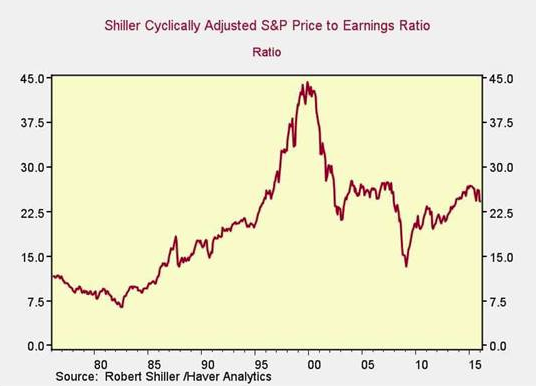
You can draw one of two conflicting conclusions here: that the past 20 years are the best indicator (and valuations are reasonable), or that the past 20 years are an aberration (and valuations are very high). With rates low and stimulus continuing, I think the past 20 years are probably the better indicator. That conclusion, however, is based on recent history and an absence of evidence for a regime change. Call this one neutral, or even slightly positive, for markets.
Risk factor #2: Changes in valuation levels
Another way to use this data is to look at changes in valuation levels over time as an indicator of trouble ahead.
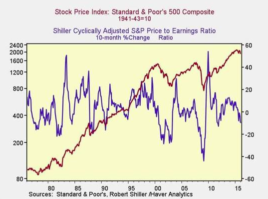
Here, you can see that when valuations roll over, with the change dropping below zero over a 10-month or 200-day period, the market itself typically falls shortly thereafter, as in 2008, 2000, 1995, and 1983. We see that kind of decline right now, so this is clearly an indicator of potential trouble.
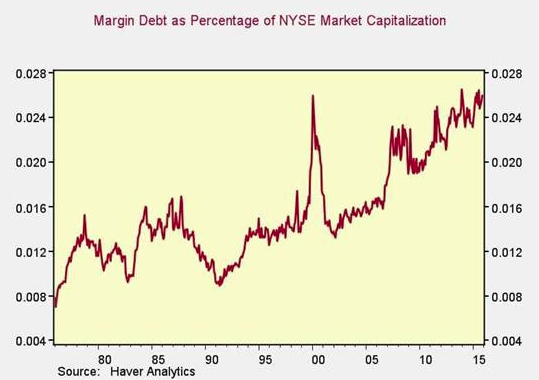
Risk factor #3: Margin debt
Another indicator of potential trouble is margin debt. In the chart below, we can see that, as a percentage of market capitalization, margin debt is very close to an all-time high, above the level of 2000. I think this is certainly an indicator of a potential deeper pullback.
Looking at the change over time, however, we don’t see the spike in debt that occurred in previous pullbacks—certainly not at the level of 2000 or 2007, or even 2011.
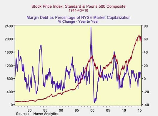
The absolute level of margin debt, then, is high, and so is the risk level, but the trigger isn’t being pulled just yet. Call this one half of a problem.
Risk factor #5: The Buffett indicator
Said to be favored by Warren Buffett, the final metric is the ratio of the value of all the companies in the market to the national economy as a whole.

On an absolute basis, this indicator is actually somewhat encouraging. Although it remains high, it has pulled back to less extreme levels. On a change-over-time basis, however, downturns in this indicator have typically preceded market pullbacks, and once again, we see that here.
Data suggests a pullback, not a crash
Based on these five indicators, a deeper downturn is very much in play. The question is whether this will be a long-term crash, like 2000 or 2008, or a shorter-term pullback like 1987, 1998, or 2011.
At this point, a pullback continues to appear more likely. Not only do the economic fundamentals look solid enough to avoid a crash, but crazy valuations and sudden changes in margin debt just aren’t there. A pullback, yes, but not a crash, at least based on the data so far.
That said, these metrics provide useful guidance, and I’m thinking of doing this analysis on a monthly basis. In conjunction with my Economic Risk Factor Update, it should provide a broader perspective for investors. What do you think?
Brad McMillan is the chief investment officer at Commonwealth Financial Network, the nation’s largest privately held independent broker/dealer-RIA. He is the primary spokesperson for Commonwealth’s investment divisions. This post originally appeared on The Independent Market Observer, a daily blog authored by Brad McMillan.