


(1) did not anticipate the Great Recession that started in December 2007,
(2) underestimated the severity of the downturn once it began, and
(3) consistently overpredicted the speed of the recovery that started in June 2009.
So, it isn’t just Wall Street that wears rose-colored glasses – they are fashionable at the Fed, too. Lansing and Pyle provide helpful charts to illustrate the FOMC’s overconfidence. This first one covers the years 2008–2010.
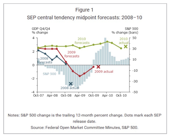
The colored lines show you how the forecast for each year evolved from the time the FOMC members initially made it. Note how they stubbornly held to their 2008 positive growth forecast even as the financial crisis unfolded, then didn’t revise their 2009 forecasts down until 2009 was underway – and then revised them too low. However, they did make a pretty good initial guess for 2010, and they stuck with it.
The next chart shows FOMC forecasts for 2011–2013.
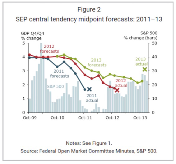
We see a different picture in this chart. As of October 2009, FOMC members expected 2011 and 2012 would both bring 4% or better GDP growth. Neither year ended anywhere near those targets. Their initial 2013 forecast was near 4% as well. They reduced it as the expected recovery failed to materialize, but as in 2009, they actually guessed too low.
One problem here is that GDP itself is a political construction. Forecasting the future is hard enough when you actually understand what you are forecasting. What happens when the yardstick itself keeps changing shape? You get meaningless forecasts. But this doesn’t stop the Fed from trying.