


I don’t know about you, but I am sick of hearing the arguments about the 4% withdrawal rule. I never saw Bill Bengen’s work as a “rule” but more of a guideline. Let’s face it, economies change, financial environments change. While we love them because they make it easy to explain our strategies to clients, rules of thumb are not built for change.
This got me thinking about how we communicate information to clients. I believe it is our job to synthesize complex material, making it easier for them to understand. As they say, “You don’t need to know how to make a watch, you just need to know how to tell time.”
Many years ago, I came up with a simplistic graph that helps clients grasp the relationship between reasonable withdrawals and sustaining growth. Although it makes the simplifying and obviously unrealistic assumption that they will receive the stated return every year like clockwork, because of its simplicity it helps control for many investors’ unrealistic expectations. I thought I would share it with you.
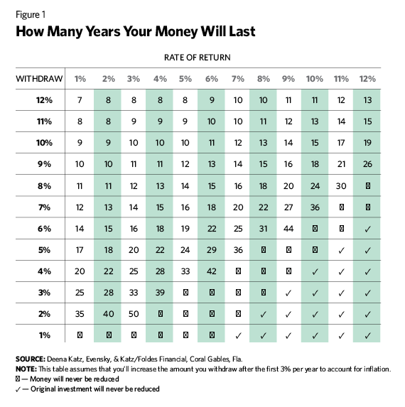
Here’s how this works. I tell the client that this little exercise is an illustration to help her understand how withdrawals affect her portfolio. I ask the client, “What do you think you should be able to withdraw from your portfolio on an annual basis?” She says 10%. “Now, what rate of return do you think you can expect on your portfolio? Bear in mind that if you had 100% in the S&P 500 over the past 10 years, your return would have been 8.1%. The client says 8%.
“With 3% inflation, your portfolio would then last 13 years. Do you think you will live longer than 13 years? Bear in mind, with your excellent health at your age (65) you will likely live past 90.” “Ah,” she says, “I guess I expect to make it to 90, at least.”
I continue, “If you still expect an 8% return over time, we could plan to take about 5% from your portfolio annually and not exhaust your money. In other words, on your $1 million portfolio, you could withdraw about $50,000. Also remember, this exercise does not account for taxes or the reality that you will not receive your expected return like clockwork.” At this stage, you might show the Bengen charts to highlight the risk of retiring at the wrong time.
While we advisors know this is overly simplistic, it doesn’t matter; the point is made and the client re-evaluates the withdrawal expectations and lowers her amount.
Over the years, we’ve devised other simple tools to illustrate concepts for clients. Perhaps our most popular one is the graph Harold Evensky created to help clients understand the relationship between risk and return.
In this chart, we first explain that many people believe their risk tolerance is low or moderate. In the first column is our interpretation of those descriptions in terms of differing portfolios.
Illustrative Tools For Synthesizing Concepts
August 3, 2015
« Previous Article
| Next Article »
Login in order to post a comment