


Key Points
• GDPNow and Donald Trump “conspire” to elevate recession fears yet again.
• At an unprecedented meeting I attended with all four living current/former Fed chairs, the topic was addressed head-on.
• Although we’re unlikely to exit from a muddle-through state, the risk of recession is objectively low.
Two events recently triggered renewed concerns about a U.S. economic recession. The first was the continued deterioration in Atlanta Fed’s GDPNow model—now down to only 0.1% for expected first quarter real gross domestic product (GDP) growth, after being as high as 2.7% in early February. The second was the pronouncement of a pending “very massive recession” by presidential candidate Donald Trump. Shortly after the latter I tweeted that there was little indication we were headed into a “very massive recession,” and boy did that elicit a very massive response from fellow tweeters. Many agreed that a severe recession was unlikely; but at least as many took the Trump side of the argument—with much “passion” I might add.
Epic gathering of current/former Fed chairs
Speaking of events, I attended an epic one last Thursday evening, about which I’m sure many of you have heard. In an unprecedented gathering at International House near Columbia University in New York City, all four current and living Federal Reserve chairs gathered for a “conversation” moderated by CNN’s Fareed Zakaria. I tweeted that it was like a Led Zeppelin reunion concert for market geeks (fellow tweeters had a lot of fun with that one).
It was a wide-ranging conversation; but perhaps most relevant to the topic of this report is that both Janet Yellen and Ben Bernanke used the time during their first answers to vehemently argue against the notion that we were plunging into a “very massive recession.” Later in the program, Alan Greenspan and Paul Volker also dispelled the notion we were plunging into the abyss.
This report is an attempt at objectivity. But before we get to the objective analysis, let me start with my view that although the risk of a massive recession is low, economic growth has been weak and is unlikely to accelerate to a level that will make many folks feel confident we are on the right track. But as Ben Bernanke made it a point to stress (a point I’ve consistently stressed as well), even though this expansion is getting long in the tooth in terms of number of years, economic expansions don’t die of old age. They die of excess—typically in growth, inflation, capital spending, monetary policy tightening, etc. If there is one benefit to such a sluggish expansion since mid-2009, it is that excess does not appear to abound.
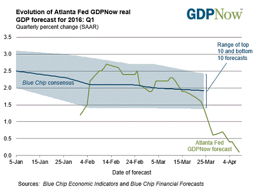
GDPNow sinks
With a heavy dose of charts and data, let’s look at the actual risks and indicators of economic recessions. First, let’s start with the aforementioned GDPNow model. Its latest downtick to near-flat economic growth is consistent with many economists’ forecasts of yet another weak first quarter for U.S. economic growth—most recently driven by weaker-than-expected trade data (courtesy of the prior strength in the U.S. dollar).
Source: Federal Reserve Bank of Atlanta, as of April 8, 2016.
Productivity has also been weak—explaining why growth expectations could be so low in the face of strong employment gains. Significant macro risks—the ongoing Eurozone crisis, China’s slowdown, oil’s crash, etc.—have kept corporate confidence low and in turn capital spending growth weak. But some of these concerns are abating, with global PMIs ticking back up. Perhaps it’s too soon to declare victory, but inflection points matter. As I often say, better or worse matters more than good or bad—it’s the rate of change and turning points which matters most for markets.
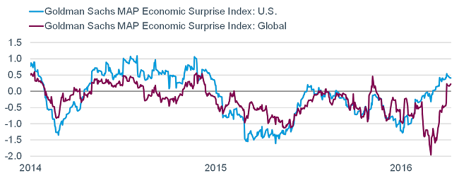
Economic surprises up markedly
Testament to this view can be seen in the chart below. It compares Goldman Sachs’ economic surprise indexes for the United States and the globe. These are indexes measuring how the high-frequency economic data is coming in relative to expectations. Importantly, they don’t measure absolute growth rates; but instead whether the data is improving or deteriorating. As you can see, U.S. data has improved markedly since the beginning of this year; with global data surging more recently.
The Goldman Sachs MAP Surprise Indices summarize the importance and strength of economic indicators and track whether the economic data as a whole are outperforming or underperforming consensus expectations. Source: Bloomberg, as of April 8, 2016.
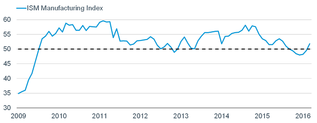
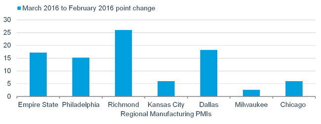
Manufacturing rebounds
I noted the strength (until recently) in the U.S. dollar, which has put a weight on the export and manufacturing side of the U.S. economy. Based on the widely-watched ISM Manufacturing Index, the manufacturing side of the economy was in contraction (sub-50) for five consecutive months…until the latest reading. As seen in the first chart below, not only has it rebounded back above the 50 line (the demarcation between expansion and contraction), the related regional manufacturing surveys have ALL accelerated in the past month, as you can see in the second chart below.
Source: FactSet. Federal Reserve Banks of New York (Empire State Manufacturing Survey), Philadelphia (Business Outlook Survey), Richmond (Survey of Manufacturing Activity), Kansas City (Manufacturing Survey) and Dallas (Texas Manufacturing Outlook Survey). Institute for Supply Management (ISM) Milwaukee (Report on Business) and Chicago (Business Survey). As of March 31, 2016.
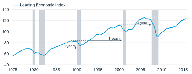
Leading indicators not signaling recession
The ISM indexes are leading indicators, which is why they are so widely watched. In fact, several of the sub-components of the ISM are within the sub-indicators which make up the Conference Board’s Index of Leading Economic Indicators (LEI). The chart below shows the progression of the LEI dating back to the mid-1970s. The gray shaded bars are official recession periods. As you can see, the LEI has always rolled over and moved down many months (if not more) before a recession has begun. The dotted lines on the chart reference what I refer to as the “round-trips”—the periods between when the LEI peaked and when it eventually returned to that prior high. The solid lines on the chart reference the periods between the end of the round trips and the subsequent recessions. As you can see, it’s been between four and eight years historically from when the LEI hits its prior high to the next recession. Note we haven’t yet seen the LEI take out the prior 2006 high in this cycle. That by no means suggests we are at least four years away from the next recession, but it would be unprecedented (at least over the past 40 years) for a recession to be imminent without any normal indication from the leading indicators.
Dotted lines represent recessions and recoveries to prior high. Solid lines and years noted correspond to period of time between recovery and next recession. Source: FactSet, The Conference Board, as of February 29, 2016.
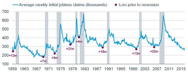
One of the more important sub-indicators within the LEI are initial unemployment claims, which have continued to move lower and are at their lowest level since the 1970s. As you can see in the chart below, it’s been anywhere between seven and 22 months from claims beginning to move higher and the subsequent recession. We are not yet at one of those inflection points.
Source: FactSet, The Conference Board, as of March 31, 2016.
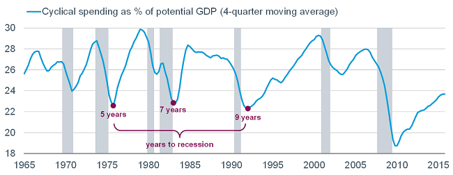
No excess in cyclical spending
At the beginning of this report I noted that economic expansions don’t die of old age—they die of excess. One way to measure this broadly, shown below, is to look at cyclical spending (definition below the chart) as a share of potential GDP. As you can see, we have only recently seen cyclical spending get back above where it BOTTOMED historically—after which it was typically many years prior to the next recession. In advance of recessions, cyclical spending typically peaked out at over 28% before rolling over and providing the recession “signal.”
Cyclical spending includes: investment in equipment and intellectual property products, residential housing, commercial real estate, consumer durables, and business inventories. Source: Bureau of Economic Analysis, Evercore ISI, as of December 31, 2015.
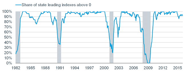
Recession models say risk remains low
Finally, there are several recession models on which I keep a close eye, the first of which is tracked by Ned Davis Research and looks at U.S. state level data. The state leading indexes are produced monthly by the Federal Reserve Bank of Philadelphia and are designed to predict the six-month growth rate of each state’s coincident index, and can be used to gauge the direction of the economy in the near-term. The latest reading shows that over 90% of states are in positive territory; while clearly in the past this indicator has dramatically deteriorated in advance of (and into) recessions.
Source: Federal Reserve Bank of Philadelphia, Ned Davis Research (NDR), Inc., as of January 31, 2016.
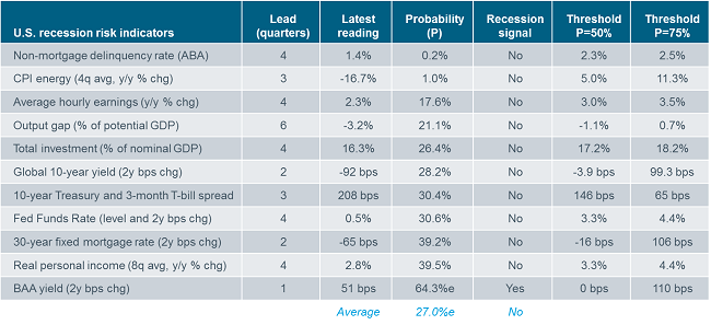
Another (newer) recession model comes from Cornerstone Macro and you can see a table of its sub-indicators below. In addition to showing the typical lead time of each indicator and its latest reading; it shows the current probability of each, whether they’re flashing a warning and the probability thresholds. At present, only one sub-indicator—junk bond yields—are flashing a recession warning. Collectively, the model shows a 27% risk of recession.
U.S. recession risk indicators
Subjective recession signal per Cornerstone Macro thru 3Q16. Thresholds indicate when the probability reaches 50% and 75%. ABA=American Bankers Association. Bps=basis points. Source: Cornerstone Macro.
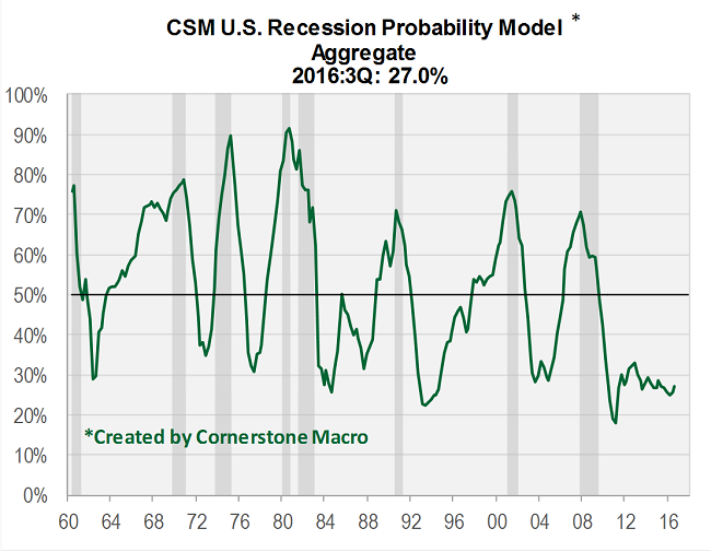
For those alarmed by the 27% reading—which in theory sounds high—take comfort in the fact that this model has rarely gotten below 25% since 1960, as you can see in the chart below. The reasoning is that the U.S. economy nearly always has a cloud or two hanging over it.
Source: Cornerstone Macro.
Weak Q1, stronger Q2?
Finally, due to a “seasonal distortion,” real GDP over the past two decades has tended to slow markedly in the first quarter, while also accelerating in the second quarter. The three weakest first quarters in this expansion to-date were -1.5% in 2011, -0.9% in 2014 and +0.6% in 2015. They were followed by +2.9%, +4.6% and +3.9% in the second quarters, respectively. The pattern will perhaps repeat again this year.
In sum, we believe the economy is not heading into a recession, but is also not likely to exit from its muddle-through state in which it’s been during this expansion. Yes, corporate profits are in their own recession—courtesy of the (prior) strength in the dollar and the (prior) plunge in oil and other commodity prices—but reversals in both potentially bode well for future earnings. We’re keeping the faith.
Liz Ann Sonders is chief investment strategist at Charles Schwab & Co.