


When I first conducted my research into withdrawal rates from retirement portfolios in the 1990s, I used only two asset classes: large-company stocks and intermediate-term government bonds. This led to an allocation of between 50% and 75% large-cap stocks to optimize what I call “SAFEMAX” (which is, historically, the lowest of all annual safe withdrawal rates). I computed SAFEMAX to be about 4.1%. This calculation assumed the client was using a tax-advantaged account and had a 30-year time horizon, with annual rebalancing.
When I introduced small-company stocks into this mix in 2006, it significantly improved the SAFEMAX (which was able to rise to about 4.5%) and lowered the overall optimum equity allocation (large cap and small cap combined) to between 50% and 60%. But I constrained small-cap stocks to a maximum of only about 17.5% of the portfolio because I was concerned about their volatility.
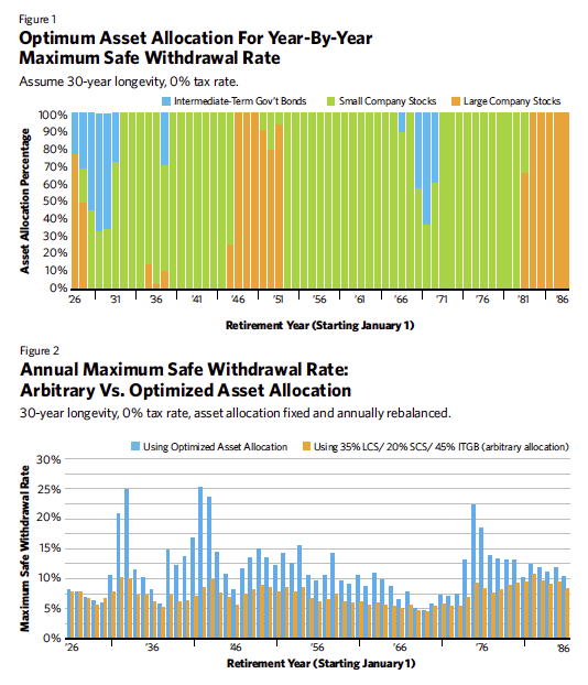
Recently, I decided to revisit the matter and derive the asset allocation every year for 61 calendar years (from 1926 to 1986) to maximize the safe withdrawal rate for each. I removed all constraints on asset allocation and let the data speak for itself in uninhibited fashion; in other words, I went “all in” on portfolio composition. The results are summarized in Figure 1.
Whoops! Perhaps I should have warned you, this chart is not for the faint of heart. It contains extremes of asset allocation that financial advisors rarely contemplate, if ever, for client portfolios. Sorry if you peeked first.
Each bar in the chart represents a one-year allocation among three asset classes: large-cap stocks, small-cap stocks and intermediate-term government bonds. The allocation for any given year remains fixed during the 30 years of retirement following (at the end of each year, the portfolio is rebalanced). By definition, each and every bar must total 100%. Clearly, however, the composition of the bars changes dramatically from year to year. Here are my primary takeaways from this chart:
1. Bonds rarely proved useful in portfolios seeking to maximize the safe withdrawal rate for a 30-year period. Of the 61 portfolios, only 11 contained any degree of bonds. The average bond exposure over the 61 portfolios was only about 7%. However, the actual exposure deviated wildly from the average—between half the portfolio and zero.
2. Bonds appeared in the mix only immediately before major stock market meltdowns, such as in the late 1920s, in 1937 and in the late 1960s.
3. Small-cap stocks were by far the most-used asset class, occurring in all but eight portfolios. The average exposure across the 61 portfolios was about 71%.
4. In only two years (1927 and 1937) were all three asset classes utilized. In most years (43 of 61 years, or about 70% of the time), only one asset class, either large-cap stocks or small-cap stocks, was the optimum asset class in which to position one’s retirement portfolio for the succeeding 30 years.
5. During most years, small-cap stocks are the only utilized asset class. In 38 of 61 years, the indicated allocation was 100% to small-cap stocks, and 0% to the other two asset classes.
6. Large-cap stocks replaced small-cap stocks in the portfolio just before periods in which the large caps were to enjoy relative outperformance, as might be expected. Large company stocks had an average portfolio exposure of 21% overall. But the average here, as it is with bonds, is misleading, and it could be said with some truth, “either the portfolios had 100% large-cap stocks or 0%.”
These results were quite unexpected. So much for diversified portfolio construction. It’s natural to ask, what did we get in exchange for adopting such a bizarre asset allocation scheme? Figure 2 reveals the safe withdrawal rates that resulted from these allocations, year by year. Here are my observations drawn from a study of this chart:
1. The safe withdrawal rates for each year using the “all-in asset allocations” in Figure 1 are always higher than the safe withdrawal rates generated by a conventional asset mix of 35% large-cap stocks, 20% small-cap stocks and 45% intermediate-term government bonds.
2. In most cases, they are dramatically higher. In some years, the all-in allocation’s safe withdrawal rate reaches 25%, while the conventional safe withdrawal rate never gets much above 10%. The average annual safe withdrawal rate using the all-in allocation is about 11.7%; with the conventional asset allocation, it is about 7.75%. Thus, on average, the all-in allocation’s annual safe withdrawal rate is about 50% higher than the rate from the conventional asset allocation.
3. There are convergences, however. In years for which safe withdrawal rates are low, the safe withdrawal rates for both the all-in asset allocation and the conventional asset allocation are virtually the same (4.6% and 4.5%, respectively, for the 1969 retiree). But as safe withdrawal rates increase, they increase much more for the all-in allocation (25% at its peak) than they do for the conventional allocation (10% at its peak).
4. SAFEMAX for the all-in allocation was 4.61%. It was achieved in the same year as the SAFEMAX for the conventional allocation (4.47%)—in 1969. Thus, the all-in allocation yielded an approximately 3% improvement in withdrawals for retirees, even when it’s most conservative manifestation, the SAFEMAX, is utilized.
Small-Cap Withdrawal Magic
September 1, 2016
« Previous Article
| Next Article »
Login in order to post a comment
Comments
-
Great stuff as always. Our research has shown that we are able to squeeze a little more withdrawal safely from a portfolio using dedicated bond portfolios on the front end and using the withdrawal pattern to establish a unique benchmark (we call it the Critical Path) to drive allocation decisions as the bonds spend down. The approach is called liability driven investing (LDI) by institutions, but can be called goals-based for individuals. As an investor increases the number of years of income set aside for spending (think individual bond funded paycheck), the tilt towards small cap and value increase since there is more time to ride through market turmoil. Steve Huxley and I have a paper coming out in the Nov JFP that takes a deeper look at the equities through a liability (goals-based) lens where minimizing the worst case scenario drives the tilts.