


Key Points
- Total credit market debt remains in the stratosphere, albeit down since the financial crisis.
- Households have deleveraged significantly, while debt servicing costs remain historically low.
- But the financial crisis also unleashed a much more frugal household.
Over a weekend when I thought, “there are no words…” so often, this report will have few words, but a lot of charts and tables. Speaking of the election, it’s been remarkable that, given the ample deficits of both presidential candidates, rarely do either discuss the country’s deficits or debt.
Liz Ann Sonders is senior vice president and chief investment strategist at Charles Schwab & Co.
In today’s report, we’ll take a top-down look at public and private sector debt and the burden it’s put on the economy. The private sector (specifically households) has actually done a pretty herculean job of deleveraging since the financial crisis. The public sector? Not so much.
First, the chart below shows total credit market debt—which includes every measurable form of debt: public sector, private sector, financial and non-financial. You can clearly see the ascent which began in the early 1980s, culminating in the 2008 bursting of the debt bubble. Since then, debt has descended from about 380% of gross domestic product (GDP), to 350% (nothing to be proud of).
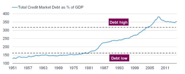
Source: FactSet, Ned Davis Research (NDR), Inc. (Further distribution prohibited without prior permission. Copyright 2016(c) Ned Davis Research, Inc. All rights reserved.), as of June 30, 2016.
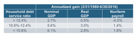
To those who believe high and/or rising debt doesn’t have implications for economic growth, have a look at the table below, which highlights the historical performance of the economy during the three highlighted zones of debt.
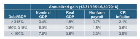
Source: Ned Davis Research (NDR), Inc. (Further distribution prohibited without prior permission. Copyright 2016(c) Ned Davis Research, Inc. All rights reserved.), as of June 30, 2016.
Tangentially, I find it discouraging that we often hear politicians (on both sides of the aisle) conflate the terms deficit and debt. The budget deficit is the annual imbalance between outlays (spending) and receipts (taxes). The federal debt is the cumulative effect of consistently running budget deficits.
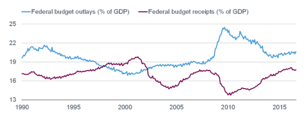
Federal Budget overlays and receipts
Source: FactSet, as of August 31, 2016.
As you can see in the chart below, the deficit has improved from its low of 10% of GDP in 2010, to about 3% currently—which is about the average since 1990. But lately, it’s begun trending down again, courtesy of outlays now trending back up, while receipts have hooked down.

Federal surplus or deficit as percentage of GDP
Source: FactSet, as of August 31, 2016.
As recently as 2013, we saw a record improvement in the budget deficit, but the pace of that improvement has clearly waned.
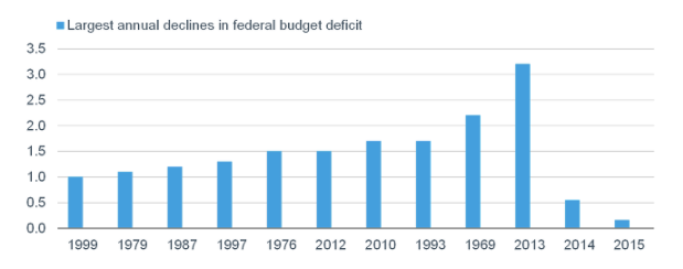
Largest annual declines in federal budget deficit
Source: Strategas Research Partners LLC.
The problem is that as long as we’re running budget deficits, debt will continue to grow. The chart below shows that the growth rate of debt has been trending down post-financial crisis. However, it’s still growing and therefore debt as a percentage of GDP continues to rise.
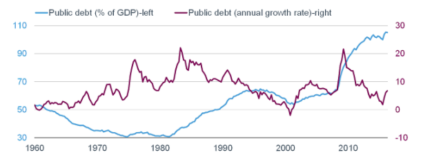
Public debt in terms of percentage of GDP and annual growth rate
Source: FactSet, Ned Davis Research, Inc. (Further distribution prohibited without prior permission. Copyright 2016(c) Ned Davis Research, Inc. All rights reserved.), as of June 30, 2016.
At present, the ability for the government to finance its debt is quite easy courtesy of extremely low interest rates. But as you can see—represented by the dotted lines—if/when interest rise, the cost of servicing our debt rises more sharply.
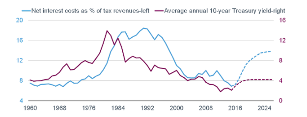
Net interest costs and annual treasury yield
Source: Office of Management and Budget, Strategas Research Partners LLC, as of March 31, 2016. Dotted lines represent 2016-2026 forecast.
But some kudos are in order for households, which were forced into an unprecedented deleveraging cycle by the financial crisis. The chart below shows household debt as a share of disposable personal income (DPI). Not only has it decelerated to below the long-term trend; it’s even moved to the pre-debt bubble trend.
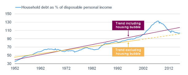
Household debt as percentage of disposable income
Source: FactSet, Federal Reserve, as of June 30, 2016. Purple and yellow lines represent trend lines.
The ability for households to finance their debt is also quite easy courtesy of extremely low interest rates. In fact, the debt service ratio—as seen below—is hovering near a record low.
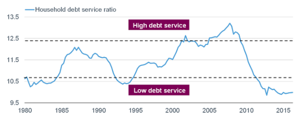
Source: FactSet, Federal Reserve, as of June 30, 2016. Household service debt ratio is an estimate of ratio of required debt payments to disposable personal income. Required minimum payments of interest and principal on outstanding mortgage and consumer debt are included.
In the past, as seen below, when the household debt service ratio was in its lowest zone, the economy performed admirably.
Source: Ned Davis Research (NDR), Inc. (Further distribution prohibited without prior permission. Copyright 2016(c) Ned Davis Research, Inc. All rights reserved.), as of June 30, 2016.
The rub for the economy this time is that households have become significantly more frugal as it relates to the balance between spending and saving. The chart below highlights the results of the Gallup Economy and Personal Finance Poll; and shows a growing and significant bias toward saving over spending. For an economy nearly 70% dependent on consumer spending, this helps explain the slow pace of growth since the recession ended in 2009.

Source: Gallup Poll Social Series: Economy and Personal Finance. Based on results of Gallup Economy and Personal Finance poll conducted on April 6-10, 2016.
Households are also mindful not to spend based on “paper” wealth. The chart below shows the renewed inverse correlation between household net worth and real (inflation-adjusted) consumer spending.
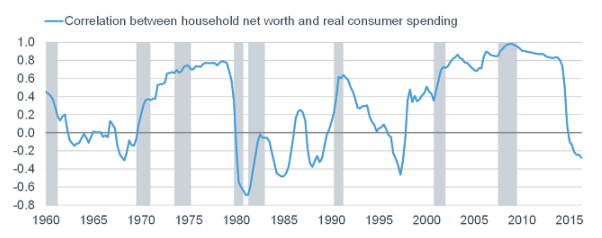
Source: Bureau of Economic Analysis, FactSet, Federal Reserve, as of June 30, 2016. Rolling 5-year correlation between y/y % change in household net worth and real consumer spending.
The net is that although households have reigned in a substantial amount of their debt burden, the public sector continues on a roll. And (depressingly), today’s elevated federal debt doesn’t include the future debt associated with massively under-funded entitlements. As we’ve clearly seen, the need to finance the debt tends to discourage private investment. This old adage is apt: “That which cannot continue, will not.” Ultimately, we will have to pay the piper. In the meantime, we can continue to watch politicians kick the can down the road.