Congratulations: We have just finished the best 12 months in the history of the S&P 500. It was exactly a year ago that the world’s most followed index hit bottom after the onset of the Covid-19 pandemic, and it has since gained more than 70%. Jim Reid, of Deutsche Bank AG, puts the return in perspective, back-calculating the index — which was launched in 1957 — to 1929, the year of the Great Crash:
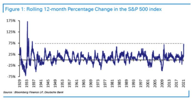
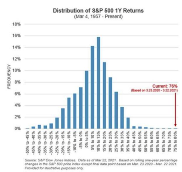
Other than the rebound following the greatest of crashes, there have never been 12 months like this. And to see how much of an outlier the last year has been, look at one-year returns since 1957, as produced by S&P Global. Overall, the pattern is as might be expected. Stock markets tend to go up steadily most of the time, punctuated by occasional sharp falls. It’s no surprise to see that the distribution is skewed to the right, meaning that in most yearlong periods the index goes up; or that it has “fat tails” on the left side, meaning that there are more really bad years than you might expect. What just happened is an extreme positive outlier. There was no historical reason for anyone to suspect that the last 12 months would be this good:
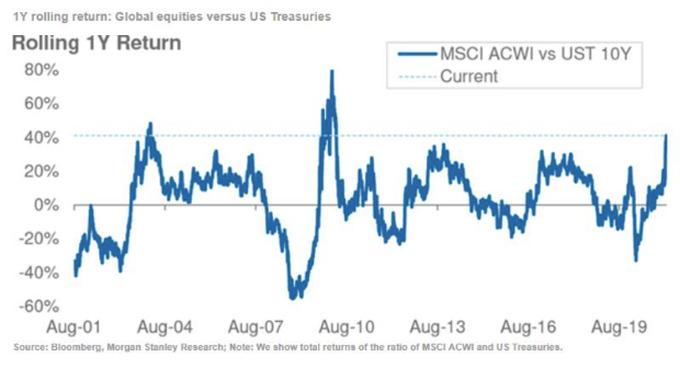
The U.S. stock market doesn’t exist in a vacuum. If we look at equities in comparison with other assets, we find that global stocks have had two better years relative to bonds in this century so far — the rebounds following the invasion of Iraq in early 2003, and the final pit of the global financial crisis in 2009. This one is very close to those, as shown by the following chart from Morgan Stanley:
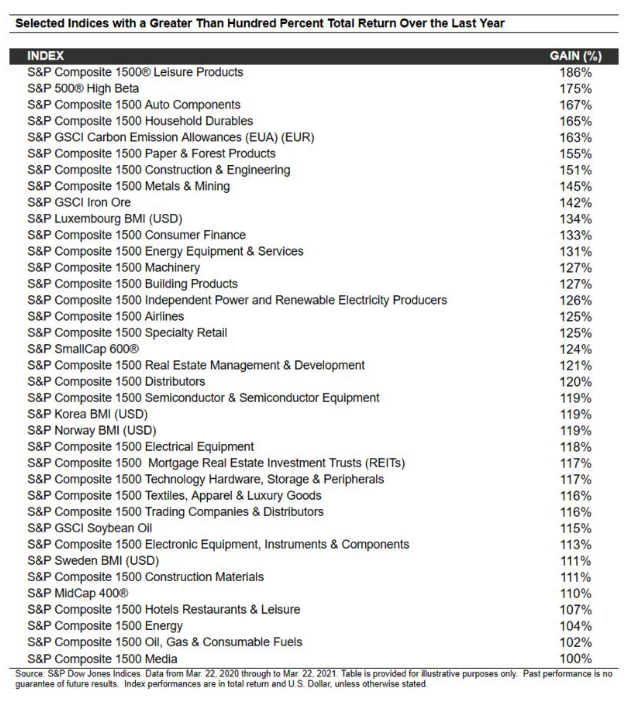
There are also plenty of assets that have done far better even than the S&P 500. Tim Edwards of S&P provided the following list, which was good up to Monday’s close of play, and so missed a poor day for the U.S. stock market on Tuesday. It’s eclectic, to say the least:
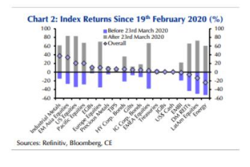
Many assets only did so well because they had sold off so drastically ahead of March 23 last year. The following chart from Capital Economics of London ranks assets by returns (shown by diamonds in the chart) since Feb. 19 last year, when the S&P peaked. Over that extended period, it has paid to invest in China, with industrial metals and emerging Asian stocks the winners. Energy, real estate and emerging markets further from China’s orbit are still below their levels of last February:
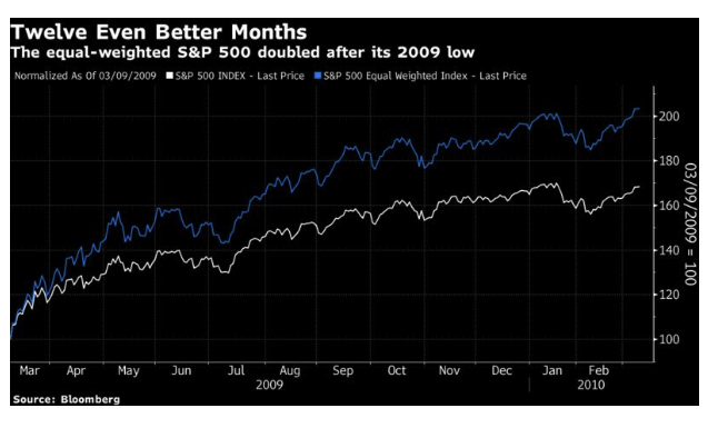
There is a focus on the S&P 500 because it is so widely used as a benchmark, but it could have been easily bettered just within the world of U.S. stocks. The equal-weighted version of the S&P, or effectively the performance of the average stock within the 500, beat the cap-weighted version and very nearly doubled:

It’s not unusual for the equal-weighted version to do better in a rally. Bigger stocks more or less by definition start off more richly valued. Indeed, this wasn’t the best ever 12 months for the equal-weighted S&P 500. That title belongs to the year following the GFC nadir, when the equal-weighted version more than doubled:
How Could We Have Spotted It?
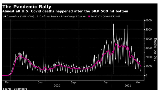
All of this raises the question — could we have spotted the buying opportunity in real time? The obvious compelling question of the time was over the damage that would be done by the pandemic. The following chart shows the course of Covid-19 deaths over the last year, with the moment to buy marked with a vertical line. Nobody could possibly have bought on the basis that the worst of the pandemic was over:
We all know now that deaths are a lagging indicator. Here is the same exercise for global Covid-19 confirmed cases. Again, there was no possible way to predict the course of the next 12 months from the data available at the time (and note that the rate of new infections has started worryingly increasing again):

As for the news flow, there was no obvious big new news on the morning of March 24, a Tuesday. The Fed had announced a massive program of support on the Sunday evening, and yet stocks had still dropped on the Monday. The U.K. announced its lockdown that Monday. And this is how Points of Return started on the Tuesday morning when the market was about to rebound:
These are extraordinary times. The Federal Reserve opened the week with a package of measures to support the market so drastic that Jim Bianco, head of Bianco Research and a Bloomberg Opinion contributor, commented: “At first blush, it looks like they are nationalizing financial markets, except for equities and high yield. This better work in stabilizing financial markets!” And yet U.S. stocks finished down for the day, as did bond yields, in part because of continuing Congressional drama that saw the Democrats continue to play a risky game and block a $2 trillion fiscal package. By the end of the day, Britain had been put under lockdown for three weeks. In one item of good news, the increase in the Italian death rate appears to be declining. Meanwhile, Spain appears to be entering its own nightmare.
This scarcely sounded like a propitious time to buy. So how might someone have decided to invest?
Arguably, the key point was that the radical uncertainty caused by the pandemic had created great risk of a financial crisis. The bond market appeared to be broken. An all-out failure of payment systems, with a liquidity failure to be followed swiftly by a solvency crisis, was a very real possibility. That was why central bankers tried so desperately to fix the problem.
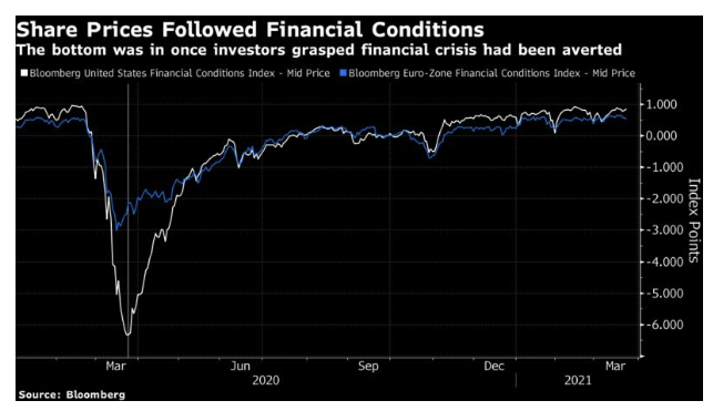
If we look at Bloomberg’s financial conditions indexes, which incorporate a number of different measures, we see that financial conditions in the EU had begun to improve a week earlier, while in the U.S. they had stopped falling on the Monday before the rebound started. With hindsight, we can see that the bottom was in. The risk of an all-out financial crisis soon receded, and stock gains over the ensuing months were boosted by the steady decline in the chances of a solvency or bankruptcy event. The pandemic was a difficult risk to measure, but the possibility of a financial crisis was much easier to gauge, and investors had clarity that it was receding. That was one way to decide to buy stocks.
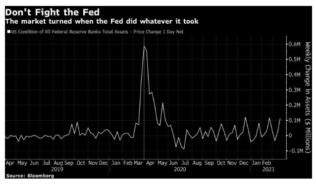
Put only slightly differently, the way to buy at the bottom was to follow the old market cliche and not fight the Fed. The package of measures that Jerome Powell outlined that Sunday night was a bazooka. Nobody could fight it. Indeed, Jim Bianco was probably right to say that they had virtually nationalized the bond market. If we go by weekly changes in the Fed’s balance sheet, there was a clear sign that the time to stop selling had arrived. The vertical line again shows the week of the turnaround:
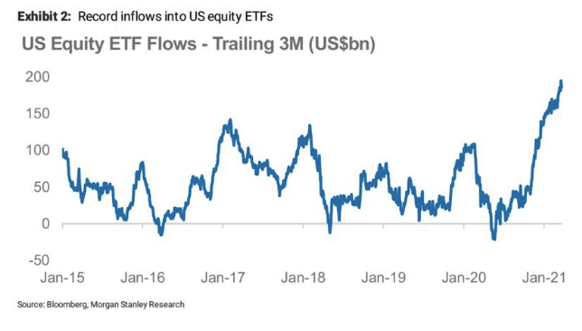
Beyond the Fed’s buying, there was also liquidity from normal investors who don’t have the power to create their own money. Flows into U.S. equity ETFs turned around in the week of the rally’s beginning, and then surfed onward for 12 months. Following liquidity and its creation clearly helped ensure that this rally turned into one for the ages:
Accountability Time
So, did Points of Return (i.e., me) help you to spot this historic buying opportunity in real time? Not really. But there were some pieces of the puzzle in there.
On the Monday after the Fed fired its bazooka, this column offered a “crisis map for investors.” James Bullard of the St Louis Fed had suggested that the U.S. unemployment rate could hit 30%, a number too terrible to contemplate. This suggested that revulsion was at hand:
These developments are signs that a) the market is beginning to attempt to price in some very negative scenarios, and b) sentiment is already close to the bottom. For stock markets, and other risk assets, that is good news.
Beyond the imponderable issue of fighting the disease, the key question is whether we can fend off a financial crisis. We should have some clarity within days and weeks.
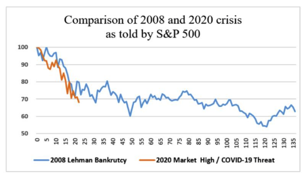
That was largely right. But I went on to share my brilliant theory that forming a bottom would be a long drawn-out process:
the pattern may well be closest to 2008, after the Lehman bankruptcy. As we can see, there was a clear early panic phase after Lehman, which ended at about this point in proceedings... Once that was over, life in the trading rooms never again felt so scary—though there would two further lows before the recovery began.
It is reasonable to expect that some kind of relief rally will get underway in the next few days. It is also reasonable to expect that the final low is still a ways off. The bottom comes when all hope has been lost, and resignation sinks in.
This was my theory, and I even drew a nice graphic to illustrate it. It proved to be misleading:
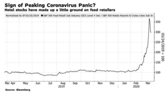
This was the newsletter on the Tuesday morning with the maximum buying opportunity, which didn’t tell people to fill their boots, but did at least include this graphic that suggested panic was peaking:
Immediately after Tuesday’s rebound, the most memorable illustration in Wednesday’s Points of Return was this cartoon, from several years earlier, taken from Asterix and the Chariot Race. The crowd are chanting the name of a Roman charioteer:

By the Thursday morning, after two propulsive rallies in a row, at least I wasn’t too dismissive:
And I have to give a shout-out to the single best call on that Tuesday morning, from my friend and former colleague James Mackintosh, now of the Wall Street Journal. This is how he began his piece:
The true contrarian only buys when it makes him feel physically sick to press the buy key. At the moment I not only feel sick at the idea but want to disinfect the keyboard before using it. Does that mean it’s time to buy?
Amid the great confusion, it wasn’t that difficult to see that a major low was nearby and that it might be time to start accumulating; it was very hard to discern that it was time to pour everything you had into the market to take advantage of the greatest yearlong rally ever. And in one thing I was flat wrong. I said that the final low “cannot come until the virus is under control.” In the event, the virus still isn’t under control and yet the market has almost doubled. While the worst scenarios that seemed possible a year ago haven’t happened, the pandemic has caused far more death, and economic disruption, than most would have predicted at the time.
It is still extraordinary that the pandemic has been so terrible and yet so much wealth has been created. That is the power of the liquidity that has gushed into the market over the past 12 months. It would be great to know what, with the benefit of hindsight, we will all be saying about this in a few more years.
Survival Tips
A propos of nothing, I stumbled across this video while writing this. It’s an hour-long documentary that tells the story of the making of Do They Know It’s Christmas?, the charity song released in 1984 that became the biggest-selling single ever in the U.K. to that date, and made the reputation of Bob Geldof. I turned 18 in 1984, and the whole episode felt like a big deal at the time. I have found watching to be the rough video-streaming equivalent of being given hot fudge sundae in an intravenous drip for an hour.
I appreciate you might have needed to be there. But to all those of you who weren’t teenagers in England in 1984, I hope it’s fun.
John Authers is a senior editor for markets. Before Bloomberg, he spent 29 years with the Financial Times, where he was head of the Lex Column and chief markets commentator. He is the author of The Fearful Rise of Markets and other books.