
-You are meeting with a client about her retirement plan. “When I began withdrawing four years ago, I started at 5.5%,” she explains. “I knew you thought that was risky, but I really needed the income! Then the market crashed, and the last few years my withdrawals have climbed above 8%. I am worried. What should I do? Cut back?”
After supplying her with an oxygen mask and urging her to breathe deeply, you promise to give the issue some serious thought. But when you do, you are confronted with a dilemma. According to the charts, an 8% withdrawal rate would be “safe” for only another dozen years, leaving your client about 14 years short on her 30-year plan. Does that mean she needs to cut her withdrawals back to 4.5% to get “safe”? That would be a draconian measure. Or is it better to do less and wait for stocks to recover, thereby naturally reducing the withdrawal rate?
In this article, I am going to suggest an approach for dealing with withdrawal plans that appear to be in trouble. We’ll begin by studying three historical retirement portfolios, each with a different inflation backdrop, to provide a foundation for our understanding of “stressed” portfolios. Then we’ll explore techniques helpful in determining whether a withdrawal plan is indeed dying, or whether it merely caught a cold. Finally, we’ll have some fun with a few case studies, in which you’ll be asked to diagnose the situation and prescribe a “cure.”
Just a brief word on my methodology. In studying withdrawal rates, I use historical data for investment returns and CPI. To date, I have reconstructed the portfolio performance of 241 investors who retired on the first day of each quarter beginning January 1, 1926, through January 1, 1986, the last year for which 30-year returns are available. For this article, I will be using U.S. small-company stocks, U.S. large-company stocks and intermediate-term U.S. government bonds as the sole asset classes, with returns derived from the Morningstar Ibbotson database. The asset allocation in all cases will be 35% large caps, 20% small caps and 45% intermediate-term government bonds. The portfolios are assumed to be tax-advantaged and are rebalanced once annually. Dollar withdrawals are assumed to increase each year by a percentage equal to the previous year’s CPI.
Part 1: Three Historical “Stressed” Portfolios
I’d like to begin by examining three “stressed” historical retirement portfolios, each of which experienced a different inflation backdrop: high inflation, moderate inflation, and low inflation to outright deflation. By “stressed” I mean that each of these portfolios had to employ a relatively low initial withdrawal rate to survive 30 years of withdrawals (the initial withdrawal rate is the first year’s dollar withdrawal divided by the starting portfolio value). Each of these three portfolios represents the historical “worst case” for its respective inflation backdrop. The importance of the inflation element will become increasingly apparent as we proceed.
Figure 1 shows annual current withdrawal rates for three retirees, one retiring on October 1, 1929 (a time of deflation), one retiring on October 1, 1936 (a time of moderate inflation), and one retiring in October 1968 (a time of high inflation), over their first 25 years. The current withdrawal rate is simply a year’s dollar withdrawal divided by the value of the portfolio at the start of that year. I omit the current withdrawal rate values for the last five years, as they are enormous and would distort the chart.
For each retiree, the initial withdrawal rate is set at a value that leaves a zero balance in the investment account on the last day of the 30th year. As you can see, all three retirees showed similar behavior in their current withdrawal rates, which rose sharply in the early years, leveled off during the middle third of retirement, and then soared toward infinity during the last third of retirement.
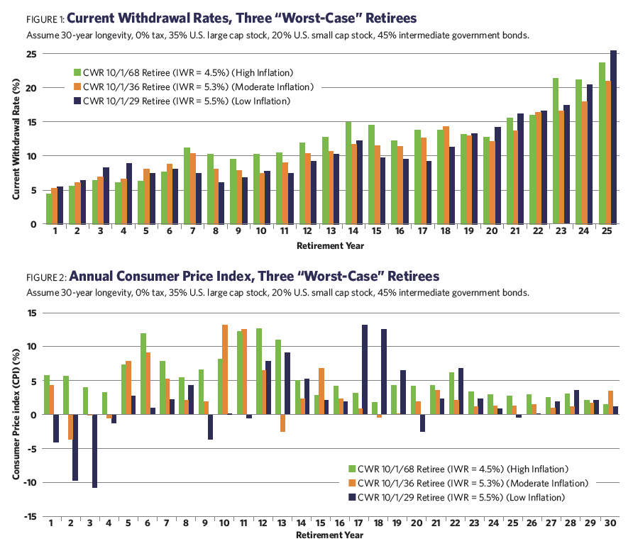
Figure 2 displays the year-by-year inflation values for each of the three retirees over the full 30-year period. It’s apparent from this chart that each of the three retirees experienced substantially different inflation regimes, especially in the early years of retirement.
It may also be observed that the initial withdrawal rate decreases with the severity of inflation.
10/1/1929 retiree: 5.5% initial withdrawal rate (30-year average inflation rate = 1.9%)
10/1/1936 retiree: 5.3% initial withdrawal rate (30-year average inflation rate = 2.9%)
10/1/1968 retiree: 4.5% initial withdrawal rate (30-year average inflation rate = 5.3%)
I coined the term “SAFEMAX” to denote the lowest initial withdrawal rate in my database, which for almost 50 years has been 4.5% and is associated with the 1968 retiree. In the foregoing analysis, we have in effect identified three different “SAFEMAX” percentages for three different inflationary regimes. This provides the opportunity to recommend an initial withdrawal rate higher than 4.5% if there is confidence that the current inflationary regime is more benign than it was in the 1970s.
Each of these three portfolios experienced one or more bear markets early in the investor’s retirement, which appears to be a necessary condition for a low initial withdrawal rate. This is the noted “sequence-of-returns” phenomenon.
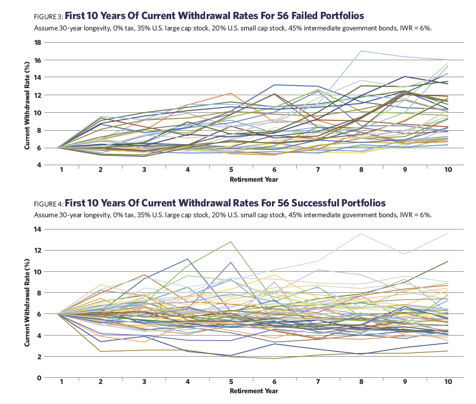
Although much emphasis in past studies (including my own) has been placed on the sequence of returns to account for the sustainability of a portfolio, our new discussion demonstrates that considerable weight should also be given to the sequence of inflation. Given that inflation has been quiescent for most of the last quarter century, it may have dropped off of some advisors’ radar screens
It is no accident that the “worst worst case” scenario (with the lowest initial withdrawal rate) was faced by the 1968 investor, who experienced the highest inflation surge of the last 90 years. In contrast, the 1929 investor experienced a far deeper drawdown in stock prices, but early deflation produced an initial withdrawal rate more than 20% higher.
Like sequence-of-returns, high inflation relatively early in retirement is critical. That’s because, in my methods, dollar withdrawals are increased each year by the prior year’s inflation rates. This tends to “lock in” elevated dollar withdrawals for the remainder of retirement. In contrast, stocks and portfolio values often recover from short-term declines, even if they are large in magnitude.
I like the current withdrawal rate as a measure of portfolio stability because it incorporates information from the two critical components of portfolio health: the value of the portfolio (reflecting input, or portfolio returns) and the dollar withdrawals from the portfolio (representing output). Portfolio values alone are an inadequate indicator, as low investment returns may be offset by slow growth (or even decline) in dollar withdrawals. This begs a question: Is the current withdrawal rate by itself sufficient to recognize a failing withdrawal plan?
Part 2: Recognizing A Failing Withdrawal Plan
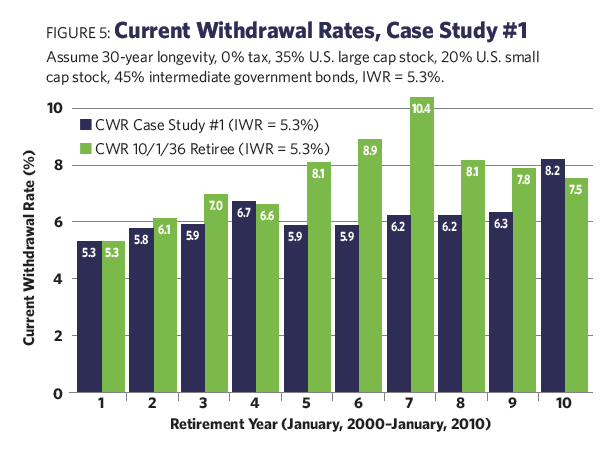
To explore the usefulness of the current withdrawal rate as a “red flag,” consider Figures 3 and 4, which track the rate over the first 10 years for a substantial number of historical retirement portfolios. I have set the initial withdrawal rate at 6.0%, well above “SAFEMAX,” to ensure that there will be a significant number of failed portfolios within the 30-year time horizon.
Of the 241 retirement portfolios in my sample, 56 failed in less than 30 years. Figure 3 displays the current withdrawal rate curve for each of the 56 failed portfolios. Quite frankly, this is a disappointing chart. All portfolios begin at the left of the chart with an initial withdrawal rate of 6.0%. However, after 10 years, the current withdrawal rates exhibit a very wide spread, ranging from just above the original 6% to over 20%. In between, the performances of the current withdrawal rates appear chaotic, with some portfolios rising initially, some falling, and some enduring a lot of ups and downs in between.
Similarly, Figure 4 displays the current withdrawal rate curve for each of 56 “successful” portfolios (those that lasted the full 30 years or longer). There were actually 185 successful portfolios, but I chose 56 representative ones for the chart to avoid clutter.
This chart is almost equally confusing. No clear patterns emerge. There are quite a few portfolios whose current withdrawal rates rose above 8% in the early years and a few whose rates rose above 10%. This would normally be a signal for concern. Yet every one of the portfolios, as their inclusion here demonstrates, recovered and lasted at least 30 years.
Taking the two charts together, there are a number of failed portfolios that attained a current withdrawal rate of 8% or greater in the five-year range, and a number of successful portfolios as well. It doesn’t appear to me that the current withdrawal rate alone has a reliable predictive value for a portfolio’s eventual success or failure. By itself, it’s an ambiguous measure over the first 10 years.
Incorporating Inflation
That doesn’t necessarily mean the measure is valueless. In fact, it sounds an alarm that something may be amiss. But we need corroborating evidence for failure, and for that I suggest comparing the current withdrawal rate chart for your client’s portfolio with the appropriate “stressed-portfolio” current withdrawal rate charts we developed in Part 1. The idea is that if your client’s current withdrawal rate curve stays below the “worst-case” current withdrawal rate chart, it should survive for 30 years. Of course, one must be sure to use the correct inflation regime chart.
For example, let’s say you believe yourself to be in a moderate inflation environment. Your client’s current withdrawal rate in year five of his retirement is 9.22%. Figure 1 shows a current withdrawal rate of 8.1% (for the 1936 moderate-inflation investor). Clearly, your client’s portfolio is performing worse than the “worst-case” standard for this environment. There may be two explanations for this: Either the client adopted an initial withdrawal rate higher than the “SAFEMAX” for the moderate-inflation environment (5.3%), and is paying a price for his aggressiveness, or he has unluckily encountered a worse-than-worst-case environment. The latter may be a new, lower “SAFEMAX” in the making. In either case, an adjustment is suggested, or the portfolio may expire prematurely.
This combination of indications appears much superior to the sole use of current withdrawal rates, but it is admittedly far from perfect. The “stressed portfolios” I recommend using as standards are for unique, stand-alone events. They reflect sequences of returns and sequences of inflation and might not work in future scenarios, even those that could be grouped as part of the same inflationary regime. There is a possibility in these for false or improperly sized signals to be generated. But it seems to me they are a reasonable starting point for our analysis. Judgment, and continual monitoring, will still be required.
Part 3: Correcting A Failing Portfolio (Case Studies)
Annuities and reverse mortgages have been explored by others in detail as means of enhancing retirement income. Those are beyond the scope of the article. Instead, I intend to focus on one primary corrective tool for portfolios: reducing dollar withdrawals to an appropriate level.
To illustrate the application of the principles outlined in the preceding section, I am going to present two case studies. I invite the reader to examine the evidence provided, formulate a diagnosis and develop an appropriate “course of treatment” if one is needed. See if you agree with my conclusions.
Note that with each case study, I include information about valuations for S&P 500 stocks. Michael Kitces has demonstrated quite convincingly that there is a strong negative correlation between the “safe” initial withdrawal rate and market valuations, as represented by the Shiller cyclically adjusted price-to-earnings ratio (CAPE). I believe that is an important piece of data advisors should consider when assessing the health of a withdrawal plan.
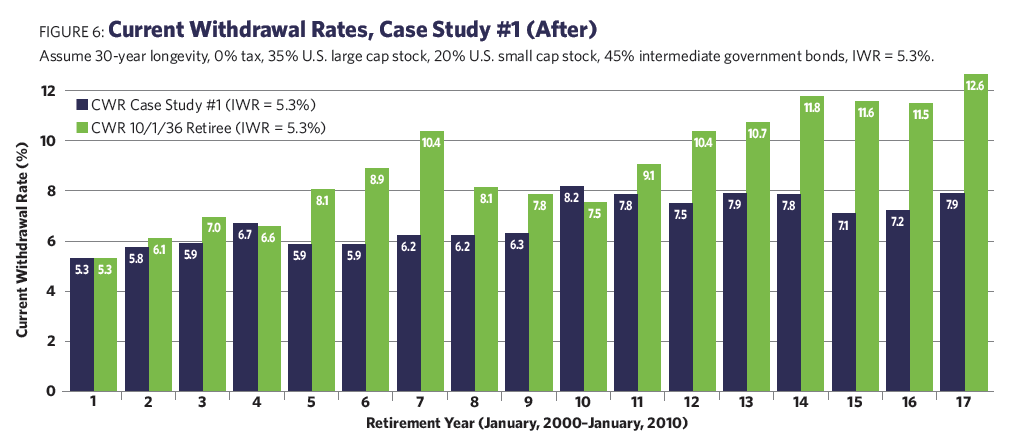
Case Study #1: Figure 5 presents the current withdrawal rate progression for a client’s portfolio, compared to the appropriate “inflation regime” current withdrawal rate chart.
In this case, the retiree, who retired January 1, 2000, just completed the 10th year of a 30-year plan, and walked into your office in early January 2010. The initial withdrawal rate was 5.3%. The Shiller CAPE at the start was 44.2 (the long-term average was 16.8). The current Shiller CAPE was 20.3.
In this case, inflation was modest for all 10 years, with no signs of acceleration. The 10th-year current withdrawal rate was 8.2% (compared to 7.5% on the moderate inflation regime chart).
The Pros: The retiree chose an appropriate initial withdrawal rate of 5.3% (the moderate-inflation regime). Inflation was moderate for the entire duration of the plan.
The Cons: The current withdrawal rate was higher than the “worst-case,” 8.2% versus 7.5% on the regime chart. Stocks are not cheap in this regime, nor are they very expensive.
Recommendations: What action, if any, should be taken to resuscitate this withdrawal plan?
The pros appear to outweigh the cons; therefore, we defer action.
The recommendation is that we make no changes in dollar withdrawals and continue to monitor the plan.
Fortunately, since this scenario was based on a historical portfolio (for the January 2000 retiree), we can “view” the results of our handiwork! This retiree experienced two major bear markets in less than a decade. With only 17 years of data available, the fate of this portfolio is still uncertain.
However, the “vital signs” of the portfolio have improved over the last seven years. The current withdrawal ratio (Figure 6) is trending well below the current withdrawal rate of the moderate-inflation standard. Things don’t look too bad—for now.
Case Study #2: Figure 7 presents the current withdrawal rate progression for this client’s portfolio, compared to the appropriate “inflation regime” current withdrawal rate chart.
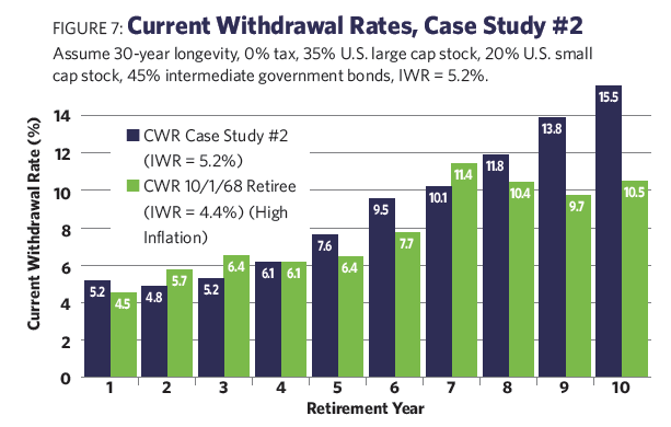
In this case, the client just completed the 10th year of a 30-year plan. The initial withdrawal rate was 5.2% (arbitrarily chosen by the client). The Shiller CAPE at the start was 15.6 (the long-term average was 16.8). The current Shiller CAPE is 13.7.
Inflation was moderate during the first two years, but it was at double-digit levels for the last eight years.
The Pros: The retiree was conservative with his initial withdrawal rate; expecting a moderate inflation environment to persist, he still chose slightly less than the corresponding SAFEMAX of 5.3%.
Also, stocks are relatively cheap (according to the Shiller CAPE).
The Cons: The current withdrawal rate of 15.5% is much higher than it was on the regime chart. Inflation has accelerated dramatically and appears to be out of control.
Recommendations: What action, if any, should be taken to resuscitate this withdrawal plan?
The cons appear to outweigh the pros; therefore, we apply a “cure.”
Inflation appears to be a horrendous problem, causing dollar withdrawals to balloon each year. The sustainability of the portfolio is clearly threatened.
This is no time for halfway measures. Although the investor began with a “low” 5.2% withdrawal rate (relative to the presumed moderate inflation regime), the subsequent surge in inflation suggests that a high-inflation regime now obtains, and the 4.5% “SAFEMAX,” would have worked better originally. The inflation situation appears worse than in the 1970s, so I recommend a 30% cut in dollar withdrawals beginning in the 11th year.
This is a case based on hypothetical data. Because the high levels of inflation persisted for several more years, the first round of “cure” proved inadequate. The adjusted portfolio would have terminated in only 21 years. Further measures were judged necessary.
Two years later, a further 35% cut was made in withdrawals. This was successful in extending the portfolio’s life to the intended 30 years (Figure 8).
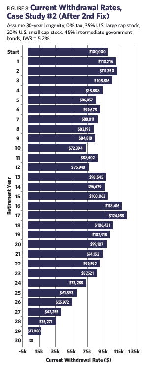
The retiree is now faced with living on just 45% of the portfolio withdrawals he had enjoyed only two years earlier. This is likely to be traumatic. Had the retiree acted five years earlier, in the sixth year, a single reduction of 35% would have sufficed, rather than the 55% that was ultimately required. This would have been painful, but far less so than the draconian measures eventually employed.
This case illustrated an inflationary episode of unprecedented severity (at least for the U.S.) coupled with poor investment returns. Had no remedial measures been taken, the portfolio would have been exhausted in just 17 years. This underscores the need for early and decisive adjustments when a high-inflation regime appears. In my opinion, high inflation, not stock markets, is the gravest threat to the viability of retirement plans.
This nightmare scenario of high inflation and low returns would have required an initial withdrawal rate of 3.6% to sustain the portfolio over 30 years. Had it been real, it would have redefined “SAFEMAX” (currently 4.5%) for the high-inflation regime.
Past Behaviors Into The Future
As I am sure the reader of this article is painfully aware, no overarching theory of finance exists that would allow us to predict the movement of markets, inflation, currencies or any of the other quantities so critical to our clients’ retirement plans. The methods of analysis and correction I have presented here depend on the continuation of past behaviors into the future. Over the last eight years, investors and retirees have enjoyed the dual benefits of strong returns from financial assets and low inflation. It would be hubris to assume these conditions are permanent, and we must be alert to circumstances that may supersede, or invalidate, our previous experience. Thus, please use my recommendations with care.
William Bengen is a retired financial advisor who first conceived the 4.5% SAFEMAX withdrawal rate. He lives in La Quinta, Calif.