It’s arguable that your website is your most valuable brand asset. It gives you valuable marketing real estate to vie for clients’ attention. On a client’s laptop, your home page gets the same screen space as that of any financial giant.
Despite the time and energy you might have spent designing your ideal office experience, it’s likely that most of your prospects will never walk through your office’s front door. Instead, their first experience with you has shifted to their encounter online, and to the website that every one of them will visit. So it’s critical to make the experience count.
This article provides a checklist of best practices that can help ensure you create an impressive first impression.
1. Follow The Five-Second Rule
Just over half of website visitors spend less than 15 seconds on a page before leaving. To keep visitors around, your home page needs to provide enough information to help visitors decide as quickly as possible that they are in the right place.
That’s where the five-second rule comes in. It’s a quick test to see how effective your home page is. Here’s how you can do it:
1. Navigate to your website’s home page.
2. Without scrolling or clicking, give yourself time to take everything in.
3. Then, see how many of the following questions you can answer:
a. Who benefits from your services?
b. What makes your firm different from others?
c. What’s your visitor’s next step?
If your page can’t answer these questions within five seconds, then you should make some edits.
Most of the five-second rule’s questions can be answered by your “hero message” (the statement at the top of your page) and by your call to action, the next step you’re asking the reader to take. So start editing there.
Be as specific as possible, without overwriting. Show whom you work with, and what makes you different, then use other elements to support this message.
WealthKeel’s website provides a great example, opening with a specific hero message and supporting it through imagery:

2. Design Your Page For First-Time Visitors
The goal of your site is to attract and convert leads. Therefore, it should be friendly to current clients but designed for first-time visitors.
To edit your site for first-time visitors, ask yourself these things:
• Is your website easy to navigate? Is your menu clear and not overly complex?
• How are you showcasing your expertise? Do you have a blog or newsletter?
• Can visitors locate and understand your fee structure?
• Are your services clearly defined and organized?
• Do you have an “about” page providing a background for your firm?
• How can visitors contact you? Is this information easy to find?
Start with your menu, which is the best place to begin since it will often help you organize where your other information should go.
And as a bonus tip, consider including two calls to action on your home page—one for visitors who are ready to contact you and another for those who want to learn more.
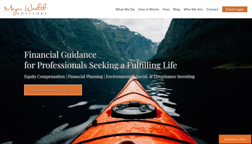
The Meyer Wealth Advisors site is a great example of these ideas in action, offering a clear menu and two calls to action to drive visitor engagement.

3. Always Provide A Fees Page
People often assume a service is more expensive if it doesn’t come with a price tag. So why invite that idea in the people visiting your website?
A fees page gives visitors expectations. It shows them exactly what they’re getting for their money and can save time for you and your team.
When crafting this page, consider your audience. Do you work with retirees or pre-retirees? If so, a more traditional assets-under-management approach might be best. Are millennials your ideal audience instead? Then consider a subscription or onetime fee structure.
You don’t have to find one fee structure for every type of client. The key is to consider your audience and use what works; multiple options can help you attract different clients.
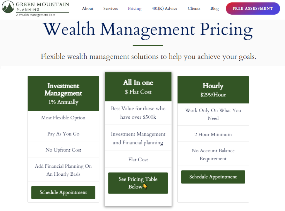
Green Mountain Planning is a firm that provides services to retirees and pre-retirees, and its website has a great example of a multi-option fees page.

4. Lay A Foundation For Search Engine Optimization
To get the most out of your website, you’ll want to make sure it’s searchable. The best way to do that is to invest in search engine optimization—which boosts your appearances in searches to increase your traffic.
This is a complex topic. Here’s a checklist of items that can help improve your site’s searchability.
Create an FAQ page: An FAQ page gives you the space to answer common questions about your firm. If someone puts that same question into a search engine, there is a chance your site could appear in the results. Be sure to make these questions highly specific to your firm.
Verify your “Google My Business” listing: This allows you to verify and display your business information within a Google search. It gives searchers a snapshot of your website, contact information and more. And if there are positive reviews, it contributes to your search ranking.
Start a blog: Blogging is one of the most powerful search engine optimization strategies you can invest in. It’s like your FAQ page, but with more information.
Be active on social media: This doesn’t directly affect your results in search engines, but it does attract site traffic and provides an outlet for blog content, both of which can improve your profile in search results.
Whenever you’re trying to drive traffic, be sure to search the terms you’re using to see what search engines provide. This will give you context into the search intent and provide possible questions related to your keywords. These questions can then be used directly in your other content to help increase ranking.
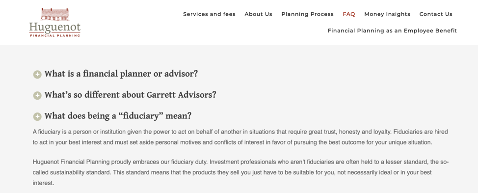
For example, the Huguenot Financial Planning site uses a mix of common and specific firm-related questions to create a comprehensive FAQ page:

5. Don’t Forget Calls To Action
Your calls to action are reminders for your readers to contact you. But in many cases, advisors are inclined to include these calls at the bottom of their pages.
Instead, provide relevant calls to action throughout your content and in key locations on your site, including:
• Your “about” page
• Your blog articles
• Your testimonials page (if they are approved for use)
• Your top-performing pages
• Your home page
You could even include a call to action that follows users from page to page.
A good rule of thumb is to include a call to action whenever new or alternative information is introduced. You never know what will catch a visitor’s eye.
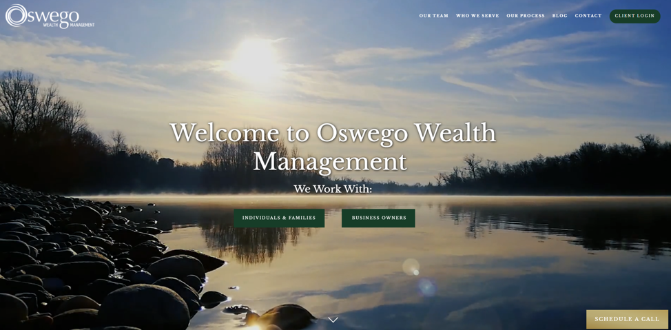
For example, the Oswego Wealth Management site uses two calls to action on its home page, along with one to follow visitors between pages.

Checking All The Boxes
Your website is your most valuable digital asset. And when it’s used correctly, it can help you attract more leads and grow your business.
Though there’s always more to learn, by following this list you’ll be headed in the right direction. So whether you’re creating your first site or editing your current one, be sure to keep these tips in mind as we move into the new year.
Susan Theder is the chief marketing and experience officer at FMG Suite.