Reporters often prepare obituaries in advance for ailing celebrities so that when the end comes, they can publish instantaneously. Occasionally, someone hits “publish” prematurely, posting tributes for public figures who are very much alive.
In the same way, much ink has been hastily spilled recently in obituaries for active management. Most of the negativity has focused on the rise of passive investing, which has enjoyed strong performance during the past few years. But simply because one style of investing has come into favor does not mean others are going the way of the dodo.
So why are so many pundits ready to write off active management? And what makes us so sure that investing actively is not only a viable but essential part of investor portfolios?
Key Points
- The performance of active and passive management has been cyclical, with each style trading periods of outperformance.
- Market corrections are a regular and unavoidable part of market cycles.
- Active management has typically outperformed passive management during market corrections, because active managers have captured alpha1 as the market recovers.
What Have You Done For Me Lately?
Recency bias is the tendency to believe that recently observed patterns will continue into the future, and it’s a powerful force that can influence investor decisions. But investors who only take recent performance into account are missing the forest for the trees. After all, yesterday’s events shouldn’t determine how tomorrow’s investment decisions are made.
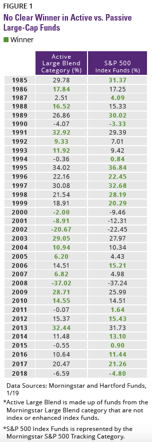
Morningstar Large Blend is the largest Morningstar category, with $2.80 trillion in net asset size, constituting 17% of the US mutual fund market.2 We selected this category because it is widely believed to be the most efficient—the one in which active investing supposedly makes the least sense. To represent active, we removed all index funds and enhanced index funds. For passive, we used the Morningstar S&P 500 Tracking category. As shown in FIGURE 1, passive large-blend strategies have outperformed active large-blend strategies for the last five years, which helps to explain why in 2018 passive US equity funds had inflows of $271 billion, while more than $175 billion under active management headed for the exits.3
But the past five years only tell part of the story. A wider look at the chart reveals active and passive have traded the lead in performance over time like two evenly matched racehorses. From 2000 to 2009, active outperformed passive nine out of 10 times. During the decade before that, passive outperformed active seven out of 10 times. And over the course of the past 34 years, active outperformed 16 times, while passive outperformed 18 times.
We’ve seen that the cyclical nature of active vs. passive investing definitely applies to the Morningstar Large Blend Category. The same holds true for other investment categories such as mid-caps, small-caps, and global/international equities. And just like performance, investor sentiment moves in cycles. If a certain style or asset class is doing well, investors are quick to extol its virtues and pour their money into it. It’s no surprise, then, that passive investing is the new darling of many investors and much of the financial press. But just as a marathon isn’t decided by the final 100 yards alone, we believe the dismissal of active management based on recent performance alone could be imprudent.
"From 2000 to 2009, active outperformed passive nine out of 10 times."
All investments are subject to risks, including the possible loss of principal. Performance data quoted represents past performance and does not guarantee future results.
Active or Passive? Yes.
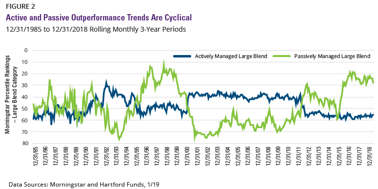
Like the ocean tides, active and passive management’s performance ebbs and flows. And as FIGURE 2 demonstrates, their performance cycles are clearly defined. The chart compares the rolling monthly 3-year performance percentile rankings for active managers with that of passive managers ranked within the Morningstar Large Blend category.
FIGURE 2 shows that while overall there is no clear winner over the past 30 years, there has been a clear winner in active vs. passive performance for multiple and sustained periods, followed by a trading of positions. Once again the recent outperformance of passive is evident, and is preceded by 10 years of dominance by active management, and so on.
The story that FIGURES 1 and 2 tell is clear. Just when it seems that active or passive has permanently pulled ahead, markets change, performance trends reverse, and the futility inherent in declaring a “winner” in active vs. passive is revealed anew.
Home Runs: Part of the Cycle
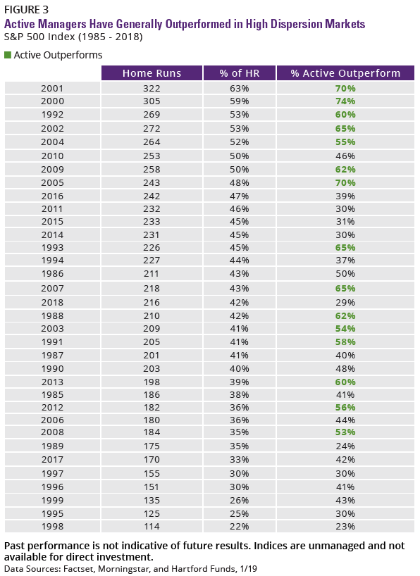
Active/passive cyclicality is further demonstrated with high and low amounts of stock “home runs”—that is, a stock that outperforms the benchmark by 25% or more. Markets that feature large amounts of home runs signal dispersion in stock returns. High dispersion should benefit active managers who can single out the winners, whereas a low number of home runs indicates stocks are moving together, which typically benefits passive management.
In FIGURE 3, we’ve ranked the past 34 years from highest to lowest in terms of which stocks within the S&P 500 Index had the most home runs. The average number of home runs during this time period was 212. Sure enough, in years that feature a high number of home runs, active tended to outperform. And when there were fewer standouts, passive was the clear winner. It’s just another example of how the performance of active and passive management has remained faithful to cyclical trends.
Active, Passive, and an Aging Bull
So what does cyclicality in active and passive management performance mean for you, the investor? We believe it demonstrates the importance of maintaining perspective (and sight of your investment goals) over time, and minimizing the undue influence of fickle market sentiment as you navigate changing market cycles. Instead of letting recent performance enchant you into chasing returns, you should instead consider current market conditions and what the future could hold.
As shown in FIGURE 4, the current bull market in equities is nearly a decade old, making it the longest bull market on record.4 Not only that, the value of the S&P 500 Index has more than tripled since its low in March 2009.5
At the individual sector valuation level, the S&P 500 Index has a historical price/earnings ratio (the ratio of a stock’s price to its earnings per share) of 18.7. As of the publication of this piece, this ratio is close to the historical average. FIGURE 5 illustrates that although we’ve been in a bull market for about a decade, eight out of 11 sectors in the S&P 500 Index are trading at a discount to their 30-year historical average. Active managers have the flexibility to seek out opportunities in undervalued sectors, while passive investments are locked into the sector allocations determined by the index.
While this bull has run for years, it hasn’t been immune to occasional corrections (as measured by a loss of 10% or greater) to help keep it healthy. Like speed limits on highways, market corrections are a necessary evil in investing, but not one to be feared. They keep markets from becoming overinflated and prevent valuations from reaching heights that lead to damaging crashes. They can also provide opportunities for active management.

Active Management Has Fared Better During Corrections
The most recent market correction arrived in December 2018. When corrections occur, you may not want to be exclusively invested in passive. Instead, you may want to consider investing in actively managed funds.
There have been 26 market corrections over the last 31 years. FIGURE 6 shows that during those corrections, active outperformed passive 15 out of 26 times, with an average rate of outperformance of 1.3%.6 Again, we compared active to passive by removing index and enhanced index funds from the Morningstar Large Blend Category to represent active, and used the S&P 500 Tracking category to represent passive.
By allowing investors to respond to ever-changing markets, active management empowers investors to maximize opportunity as conditions demand. But if you’re locked into an index fund, you could be exposed to significant downside due to single-sector performance. For example, during the collapse of the dot-com bubble in 2000, active management outperformed passive significantly, -0.3% to -9.50%.7 Much of the blame for passive’s underperformance during that period can be laid at the feet of a single sector.
As FIGURE 7 shows, the technology sector made up almost 30% of the S&P 500 Index at that time. The sector (as represented by the S&P 500 Information Technology Index) crashed hard, to the tune of a 38.71% decline in 2000.
Meanwhile, the average active manager was significantly underweight technology relative to the index (21% vs. 30%), which helped limit the damage done to their portfolios when the tech bubble burst. Active managers with a positive return during this time were more underweight to technology with 15%, and those with a negative return hewed closer to the index with a 28% weighting.8 For a more recent example, one need only look back to the decline in oil prices in 2014 to see how passive investors were hurt by their inability to reduce exposure to an underperforming sector.
When bull markets inevitably turn, passive managers could be left holding stocks and sectors with poor fundamentals and inflated valuations. Meanwhile, active managers have the ability to mitigate risk by reducing exposures to expensive areas that will be hit hardest, and conversely, increase exposure as sectors or asset classes recover to capture upside as the new market cycle begins.


Investment Implications:
This insight focused on active vs. passive investing in the Morningstar Large Blend category because it’s widely believed to be the most efficient category—the one that should invariably favor passive investing. Yet even this category shows the cyclical nature of active and passive performance. The same cyclicality is present in other investment categories such as mid-caps, small-caps, and global/international equities.
Just as we think declaring active management dead is premature, we don’t contend that active management is the only suitable choice for investors. Far from it. We believe that the choice between active and passive management is not a zero-sum game, but that each has a place in investor portfolios based on the individual needs and wants of the investor. With that in mind, here are some conclusions to take away from this piece:
- The performance of active and passive management is cyclical, meaning each style goes through extended periods of outperformance.
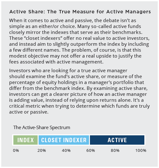
- When evaluating active and passive management, looking beyond recent performance and measuring active share is important.
- As we saw in December 2018, market corrections are inevitable and a common occurrence in equity markets over time.
- There have been 26 market corrections over the past 31 years, and active management outperformed passive management in 15 out of 26 corrections.
- During market corrections, the flexibility of active management allows for reducing exposure on the downside and ramping up exposure to capture alpha in the early stages of recovery.
1 The measure of the performance of a portfolio after adjusting for risk. Alpha is calculated by comparing the volatility of the portfolio and comparing it to some benchmark. The alpha is the excess return of the portfolio over the benchmark.
2,3 Source: Morningstar Direct, 1/19
4 Data Sources: Ned Davis Research and Hartford Funds, 2/19
5 Data Sources: Morningstar and Hartford Funds, 1/19
6 Source: Ned Davis Research, 2/19
7 As represented by the S&P 500 Index, from 1/1/00 to 12/31/00
8 Source: Morningstar, 2/18
This information should not be considered investment advice or a recommendation to buy/sell any security. In addition, it does not take into account the specific investment objectives, tax and financial condition of any specific person. This information has been prepared from sources believed reliable but the accuracy and completeness of the information cannot be guaranteed. This material and/or its contents are current at the time of writing and are subject to change without notice. This material may not be copied, photocopied or duplicated in any form or distributed in whole or in part, for any purpose, without the express written consent of Hartford Funds.
All investments are subject to risks, including the possible loss of principal.
Hartford Funds Distributors, LLC, Member FINRA.
213111