I fondly remember a time when I didn’t write about inflation every day. It would be good to get back to that, but today is not the day. The U.S. consumer price inflation data for September is with us. With it, I will say tentatively, the debate over whether the current dose of inflation is merely transitory is almost at an end. There’s room for much argument about what should be done about rising prices, but there’s no longer any sensible way to dismiss this inflation episode as merely transitory.
As is customary on these occasions, I will try to illustrate this for you with some charts ... lots of charts. Let’s start with the only inflation numbers most of us used to look at: the headline and core (excluding food and fuel) measures of CPI. Here they are, for the last decade:
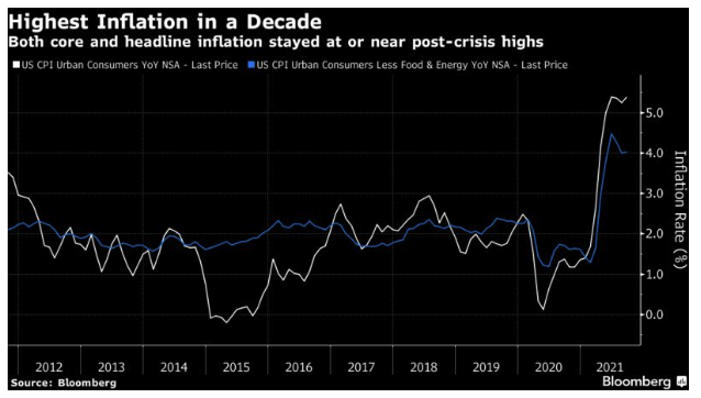
The headline number is back to its high of 5.4%, and the core is still above 4.0%, having stopped decreasing. This may well soon pass, but it’s not just a transitory reaction to the pandemic.
To illustrate, let’s go through some of the alternative measures of inflation that have all become more familiar of late. To start, here is what might be called the “Stepford core inflation rate,” which the Bureau of Labor Statistics started to publish earlier this year. It excludes a whole laundry list of things that many of us generally want to buy: food, energy, shelter, and used cars and trucks:
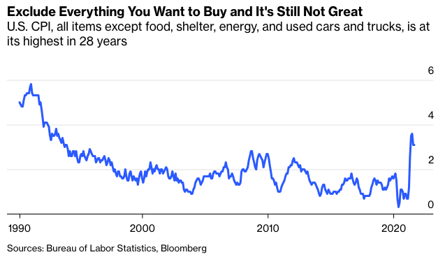
Excluding all those things reduces the rate, but it’s still above 3%, and barely down from its peak, and it’s still at a level not previously seen in 28 years. The rise in used car prices has been extraordinary, thanks to pandemic interruptions to supply chains, but this is not an inflation scare that goes away if you exclude used cars.
Now let’s look at the “trimmed mean” rate of inflation, as produced by the Cleveland Fed, which excludes the main outliers in both directions, whatever they are. Economists consider this a good and rigorous measure of underlying inflation. And it’s very high:
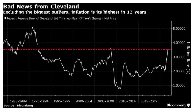
The trimmed mean rose very sharply for the third month in a row and is far above 3%, the upper range of the Federal Reserve's target. With the exception of two months during the the worst of the oil-price spike that preceded the global financial crisis in 2008, it’s the highest in 30 years. It’s more than four standard deviations above the the norm for the last decade.
Six months ago, many were urging observers to focus on the trimmed mean, on the assumption it would reveal that high headline rates were driven only by a few extreme sectors. Instead, it is showing that inflationary pressure is steadily broadening.
For a more positive measure, try the median level of inflation, also produced by the Cleveland Fed. Over history, it has tended to move with the trimmed mean, but not recently. It is also rising sharply, but compared to its own history it is not at a level to cause any great concern:
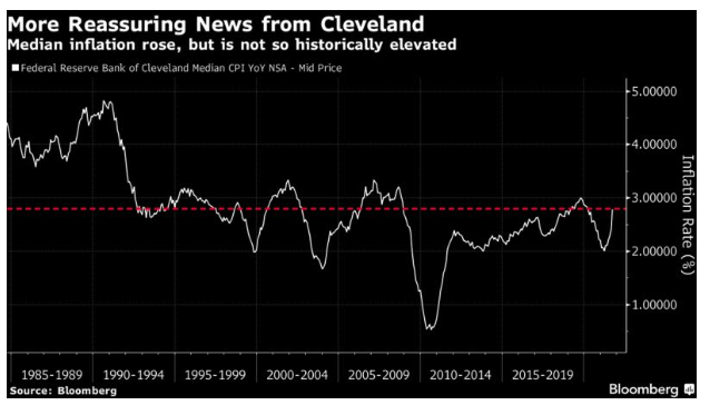
Play around with the data, then, and you make the current rate of inflation look less terrifying. It still looks like the worst price spike in more than a decade, and the measures of core inflation are catching up with the headline.
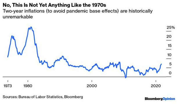
What About Base Effects?
There is an argument that this is all about base effects. Last year saw an epic sudden stop for the economy, along with a collapse in oil prices. Of course inflation will look high 12 months after those events.
Using brute force and ignorance, we can counter this effect by looking at the 24-month inflation rate over time, rather than the 12-month inflation rate. This exercise shows that inflation is indeed rising at present, but it is nothing remotely like what the U.S. experienced in the 1970s:
As the 1970s make it hard to see what is happening more recently on that chart, here is the same exercise for the last 25 years. This demonstrates (1) that there is more to this spike than base effects but (2) 24-month inflation is still lower than it was for most of a three-year period before the financial crisis, from 2005 to 2008:
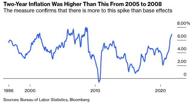
If this were purely transitory, the bump in inflation would disappear once we took a longer period. It isn’t purely transitory, and it's clearly the worst inflation since the global financial crisis. But taking the longer period makes this incident look less severe.
What Went Up And What Went Down?
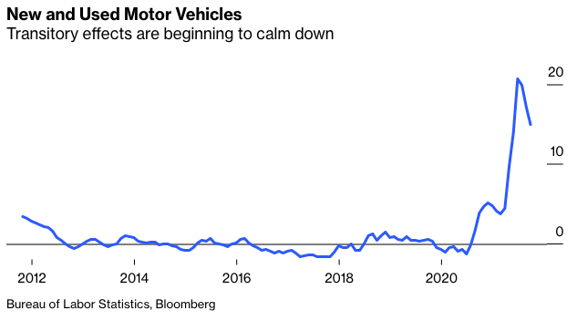
The Bureau of Labor Statistics publishes all the data that go into calculating their numbers, and this year we have all started to look at them much more carefully. If we look at some of the sectors most affected by Covid, we can see the extreme effects fading away. This is inflation in new and used motor vehicles:
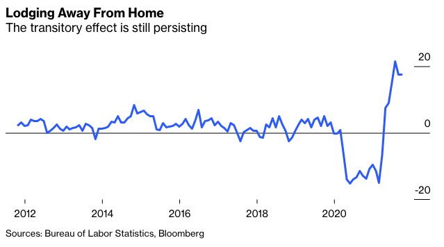
But some of the sectors that took a knock from the pandemic are taking a little longer to return to normal. Hotel inflation still looks high on a 12-month view. There are still some transitory effects that will drop out of the calculation in the months ahead:
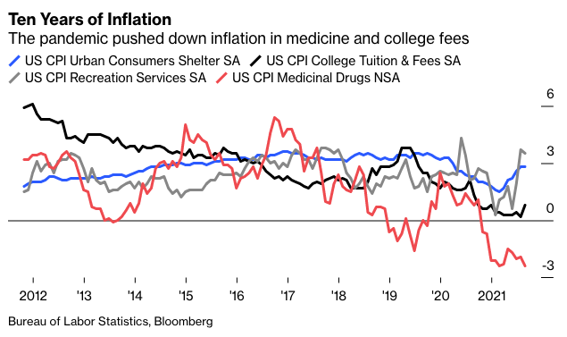
There are other sectors where prices have been reduced by the pandemic. The following chart shows inflation over the last 10 years for four CPI components that we include in the regular inflation indicators. Medicine prices are actually falling, and college tuition fees inflation is historically low (although annoyingly it has started to rise again). Recreation services prices, which might be expected to rise as we reopen after the pandemic, are inflating at more than 3%, but the effect is not extreme.
The critical measure for the next few months is for shelter inflation. It is still well within its normal range, but the rise in employment and in house prices over the last year means that it is very, very likely to rise from here.
The overall picture, then, is that different components are behaving much as might be expected, with the most extreme effects dampening but inflation spreading. We can now analyze this in more detail.
Yes, ECAN
Bloomberg has produced a great new tool that those with access to a Terminal can play with by typing in ECAN <GO>. It makes it easy to break down the factors in inflation data (and lots of other economic data). To start with, this is how the year-on-year increase in headline inflation can be broken down between energy, components affected by reopening, and components not affected by reopening:
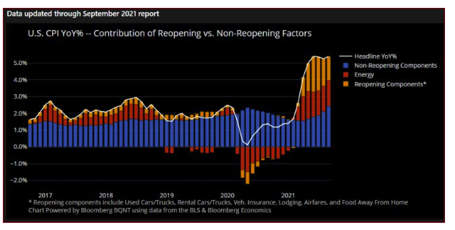
This handily shows that the “reopening” effect is dwindling with time — although still substantial — while the sectors not driven by reopening, in blue, are increasing to take up the slack.
But this is a 12-month measure, affected by base effects. This is the same exercise, conducted for month-on-month inflation:
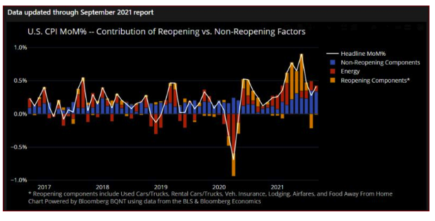
Last month, substantially all of the increase in inflation came from sectors that were not particularly affected by the pandemic. On a month-by-month basis the pandemic effect is over, and yet inflation remains elevated.
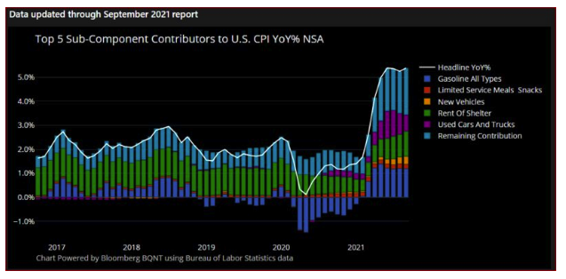
Taking things to another level of granularity, here are the five components that have contributed most to the September year-on-year number. This exercise makes clear why there is so much concern over rents and shelter inflation. It is a huge chunk of the index. Before much longer, discussions of inflation will likely say little about Covid, and will instead be dominated by rents and housing:
In short, ECAN is mighty useful. If you’re on a Bloomberg Terminal, it’s worth taking it for a test drive.
The Labor Market
The other critical inflationary driver is the labor market. Will workers insist on higher wages to cover higher living costs, will employers pay them those wages, and will there be a new wage-price spiral? One other new data point is concerning on this point. Wages are rising, but very unusually they are failing to keep up with living costs. This is how average real weekly earnings have moved, according to the BLS:
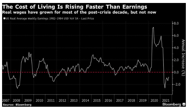
So, if employees have any sense, they are going to ask for higher wages from here. Given the number of vacancies, it will be hard to say no to them. On the face of it, there is reason to be concerned about pressure on prices from the labor market.
Transitory Fun In The Twitterverse
I don't think it makes sense to call this inflation “transitory,” although I hope it’s also clear that comparisons to the 1970s are wildly disproportionate. On Twitter, however, the debate continues. The following chart appeared on Twitter, along with the message “Team transitory won btw.” It triggered heated debate:
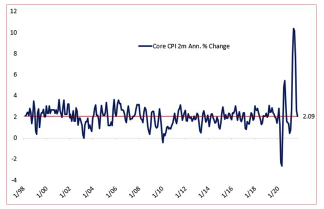
I don’t remember anyone telling me to keep an eye on the two-month annualized percentage change in core CPI, but maybe this measure is of interest. Twitter has some expert chartists who know exactly how to lie with statistics, however.
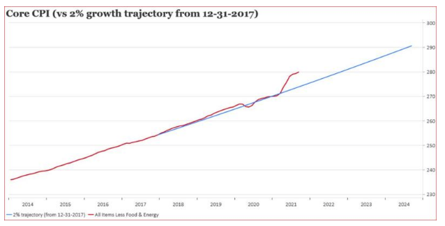
One contribution was to suggest that core inflation needed to return to its trend line of 2% per year. It has departed from it in the last year:
But there’s always fun to be had with changing the time scale on the X axis. Take the same chart back two decades, and we find that this episode still leaves inflation below a 2% per annum trend:
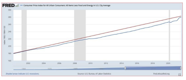
Inflation in prices has been very low for a very long time, and that needs to be kept in mind. It’s possible we are witnessing a jolt out of a deflationary era that had lasted a quarter of a century. But for the time being, the era of stable prices continues.
What Next?
The key questions for investors arising from this are: What should we do about it, and what should we expect central banks to do about it?
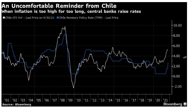
On the latter, Chile provided an uncomfortable reminder that when inflation gets above a central bank’s target, it responds by hiking rates. Chile’s central bank raised its base rate by 125 bps in a bid to rein in a dose of inflation that hit just after the country saw a wave of protests over the high cost of living:
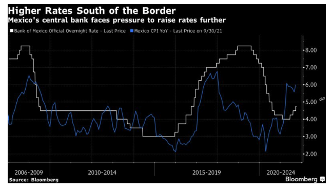
For countries without the “exorbitant privilege” of the dollar, hiking in response to elevated inflation is already a fact of life. Closer to the U.S., Mexico’s central bank has already hiked three times this year, and history suggests it will need to do so several more times.
Monetary tightening by the U.S. would add to the problems for Latin America by strengthening the dollar and putting more pressure on Latin American currencies. However, monetary tightening looks ever more likely. A few hours after the CPI data were published, the Fed published the minutes of the Federal Open Market Committee’s meeting last month, which confirmed that a start to tapering off asset purchases next month is a near certainty. It also conceded about as directly as a central bank ever can that it had underestimated the dangers of inflation:
Most participants saw inflation risks as weighted to the upside because of concerns that supply disruptions and labor shortages might last longer and might have larger or more persistent effects on prices and wages than they currently assumed.
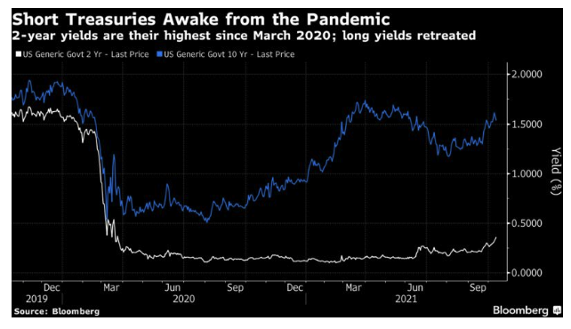
Markets took the hint. Two-year yields are their highest since March last year, when the pandemic first hit. Meanwhile, the 10-year yield retreated from an approach toward its post-pandemic high. The two-year reflects the now-strong likelihood that the Fed will raise rates within the next two years; the 10-year reflects concerns about growth. As a reaction to one day’s welter of data, that seemed reasonable:
For the future, all of this will make life more difficult for investors. More of that anon. The need to write and talk about inflation will continue.
Survival Tips
Let's get back to James Bond. I see some critics are complaining that the new movie is too long. They're Philistines.
Meanwhile, my request on Twitter for jokes about long Bond movies and long bonds (inspired by Kate Duguid of the Financial Times) yielded:
Perpetuals are Forever.
Do you expect me to yield? No, Long Bond, I expect you to die.
The new Bond is so long I couldn't stay for the duration
Been short 30 UST since Sunday; No Time To Cry
Sounds like there are some Bond vigilantes out there
The long Bond is like the long bond: only pensioners are interested
Oh, well, you live and let die. (I’ll get my coat.)
John Authers is a senior editor for markets. Before Bloomberg, he spent 29 years with the Financial Times, where he was head of the Lex Column and chief markets commentator. He is the author of The Fearful Rise of Markets and other books.