


Yesterday was a bad day in the market. The Dow was down more than 800 points (800 points!), and the S&P was down almost 100 points (100 points!). Surely, this is the beginning of the end.
Maybe so. But if you turn those drops into percentage terms, of just more than 3 percent, they don’t look nearly as scary. I’ll grant you, declines of 3 percent in one day can rattle markets. Historically, however, they happen every three to six months. So, in a normal year, we should see a day like yesterday two or three times—and that is just what is happening in 2018. We saw an even bigger drop in January and February (remember that?) and another one in March. This year is shaping up as quite average in that sense.
Bigger picture, then, we are not yet at a worry point. The S&P 500 is now down just under 5 percent from the all-time high, which doesn’t even qualify as a correction. We have returned to levels last seen in July. Again, it is not nothing but certainly not a big deal.
This is not to minimize yesterday, but instead to try to understand what it means. Is this a time to worry? History says days like this are normal. So, as scary as yesterday’s market action has been, the damage thus far is not actually all that bad—something to keep in mind. Still, there is reason to pay attention.
200-Day Moving Average
As I have said multiple times, I start to pay attention when the market cracks its 200-day moving average. We got very close to doing that yesterday, for the first time since April of this year and since June 2016 before that. This break of a long-term trend line is definitely something worth noting. It doesn’t happen that often, and it can be a sign of more trouble ahead. We are not there yet. But the fact that we are that close, and could easily break it from here, means we should pay attention.
Here again, though, this is a reason to pay attention but not to panic. The market broke through the trend line several times on a daily basis earlier this year and in 2016, only to bounce back up. Looking at the past several years, we can see that there have been multiple breaks, some lasting for months. Ultimately, however, the market bounced back and moved higher.
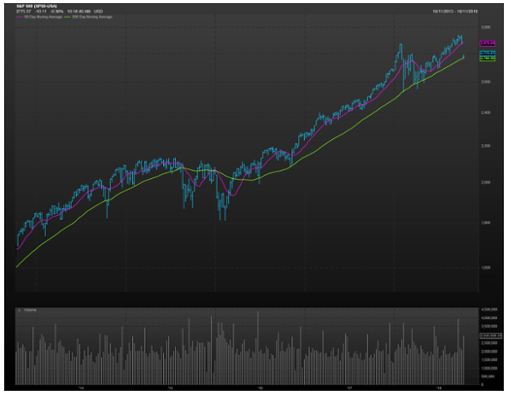
Looking at the chart above, we saw breaks earlier this year, as well as in 2016 (remember that?) and in 2015, which both lasted for months. We also saw quick breaks in 2014 and 2012. And, of course, we saw long breaks in 2011 and 2010. But the past seven breaks below the 200-day trend line have been false alarms rather than signals of something worse. Chances are that this one is a false alarm as well—but maybe not. How will we know?
Could Things Get Worse?