


How long will it take Black Americans to catch up to their White neighbors’ quality of life? The headline answer is 320 years, at least according to a new report by the McKinsey Institute for Black Economic Mobility. Specifically, that’s the estimate based on a combination of economic, health and other metrics for the 8.7% of Black Americans who live in what McKinsey dubs “stable rural counties,” where the catch-up period is longest. The shortest catch-up time is 110 years, in “trailing rural counties” where residents of all races are struggling. In the “urban periphery”—the suburban counties that by most measures deliver the best quality-of-life outcomes for their Black residents—it’s 120 years. This is assuming things stand still for White residents, which outside of those trailing rural counties they probably won’t.
The report is invaluable in showing that the kinds of counties where Black Americans are most overrepresented and where almost half of them live, what McKinsey calls “megacities” (New York, Los Angeles, Chicago, etc.; estimated catch-up time: 160 years) and “stable cities” (Detroit, Pittsburgh, Birmingham, etc.; catch-up time: 240 years), don’t offer great quality of life for their Black residents. Wondering why Black people have been leaving many of these places? Here’s part of your answer.
But those estimates on catch-up time, while admittedly catchy, rely on so many assumptions that it’s hard to know what to make of them. As I read through the report and looked over its snazzy graphics, I kept thinking that what I really wanted to see was simple line charts and trend extrapolations. So I made some. On the core economic measures of income and wealth, the message they deliver is that catching up could take a lot longer than 320 years. On others, the trends are more encouraging.
To start, here’s median household income for the racial and ethnic groups for which the Census Bureau has half a century or more of annual income data.
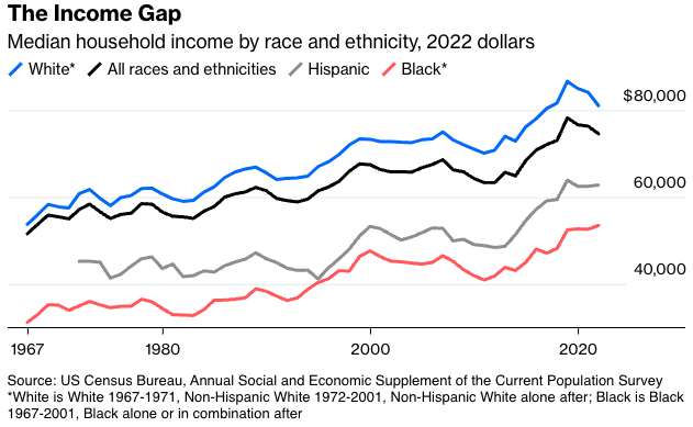
Left off here (because data for them are available only back to 1987, plus I was trying to keep the chart from having too many lines to decipher) are Asians, the most affluent racial group, with a 2022 median household income of $108,700, and American Indians and Alaska Natives, who have had higher incomes than Black Americans in most years but were slightly behind them in 2022, at $52,810 compared with $53,500. As the chart footnote indicates, there are multiple permutations of these racial and ethnic categories, especially since the Clinton administration decreed in the late 1990s that Census respondents be allowed to self-identify as more than one race. I’ve chosen here to include those identifying as Black in combination with one or more other race in the Black category, in part because that paints a slightly more optimistic picture.
It’s still not a picture, though, that shows Black Americans’ incomes ever converging with those of White ones. I asked Excel to draw trend lines—which minimize the sum of the squared distances from every data point to the line—through the historical data on White and Black median incomes. Here’s how things look if one continues them out to 2050.
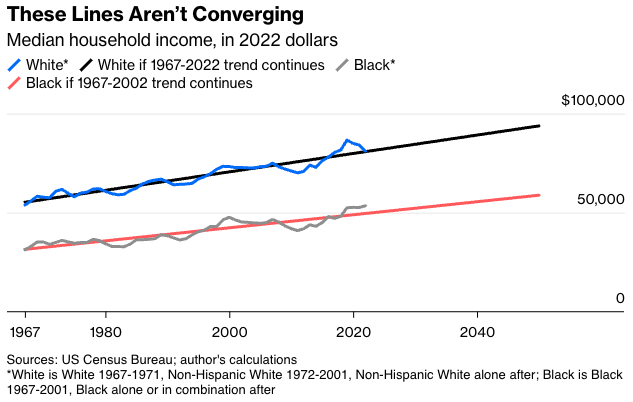
Keep moving into the future, and the lines keep getting further apart in dollar terms. Incomes grew at a faster percentage rate for Black Americans than White ones from 1967 to 2022, so the percentage gap between the trend lines does shrink, but it does so excruciatingly slowly, with the median household income of Black Americans not reaching 70% of that of White ones until 3763.
The gap is even bigger and the divergence more pronounced when it comes to wealth, which the Federal Reserve Board has measured since 1989 in its triennial Survey of Consumer Finances.
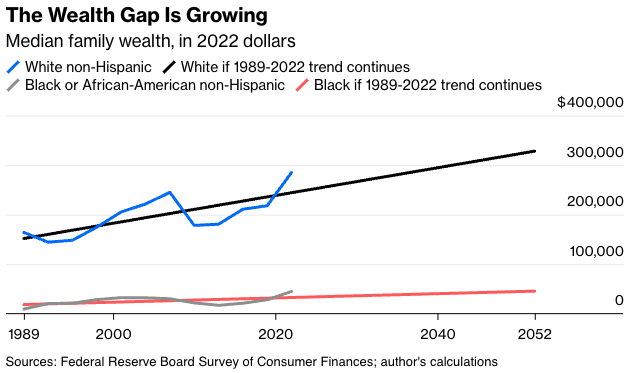
In 2022, the median Black family had just 15.7% the wealth of the median White family (going by mean wealth, it’s a similar 15.5%). If current trends continue, the percentage will still be in that general territory millions of years from now. Math is fun, but it can deliver some pretty depressing results.
These are trend lines based on a few decades of survey data with significant sampling error, not laws of economics. With real median income rising for Black Americans and falling for White ones since 2019, one could even draw lines based on the 2019-2022 data that show Black incomes passing White ones 12 years from now. Over most longer periods, though, the income and wealth gaps have been growing. The Census Bureau also has median family income estimates for White and non-White Americans from 1947 to 1970, and those show a pattern of divergence similar to the 1967-2022 household income data.
Past performance is no guarantee of future results, as they say in the mutual fund business. But with other surveys showing that Americans think Black Americans have made big relative wealth gains in recent decades and now possess average wealth more than 80% that of White Americans, just making more people aware of the actual figures seems pretty valuable. The government policies and economic developments of the past half-century or so have not reduced the income and wealth disadvantages faced by Black Americans. That’s important to know.
It’s also important to know that not all the quality-of-life trends are so discouraging. The most basic of them all, life expectancy, showed Black Americans so clearly headed for convergence with White Americans as of about a decade ago that I’m not going to bother with trend lines.
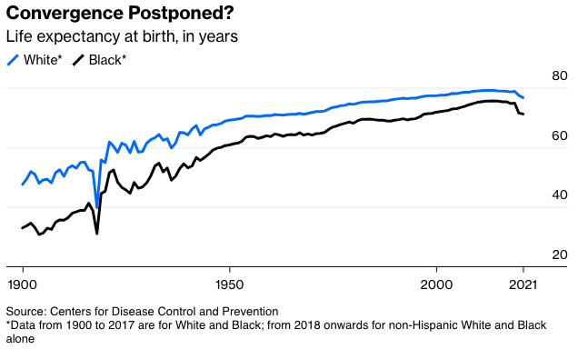
Life expectancy started to fall in 2015 for both Black and White Americans, with the opioid epidemic a chief cause. The Covid-19 pandemic accelerated the decline for both, but much more so for Black Americans, who were more likely to die of the disease but also of other pandemic-related scourges like the rise in murders and in traffic accidents. Provisional mortality numbers for 2022 and 2023 from the Centers for Disease Control and Prevention, which aren’t reflected in the above chart, show sharper mortality declines since 2021 for Black Americans than White ones, meaning the life expectancy lines will move closer together again. What comes after that is anybody’s guess, but overall the life expectancy data show much more evidence of convergence than the income and wealth data do.
With employment, the picture is … interesting. I’ve separated the statistics for men and women because not doing so obscures a lot. Here’s the prime-age employment-population ratio, the simplest and most reliable measure of the health of labor market, for Black and White men.
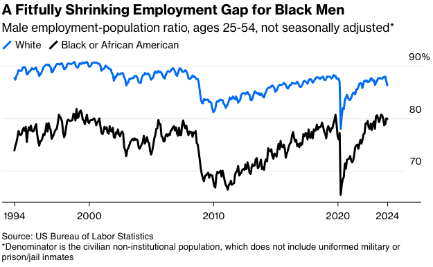
If you draw trend lines through these data they do converge eventually—in May 2247 to be precise—but it’s clear there’s a big cyclical element to the gap, too. It grows during recessions, and shrinks during expansions, especially after they’ve been going for a few years. Also, some of the decline in the gap in the 1990s and 2000s was due to sharp increases in prison populations that consisted disproportionately of Black men, thus driving down the civilian non-institutional population denominator from which the employment ratio for Black men is calculated. Since 2007, that process has been working in reverse as the Black prison population has fallen 36%, so the true trend toward convergence may be stronger than the data show.
For Black women, employment-ratio convergence is already here.
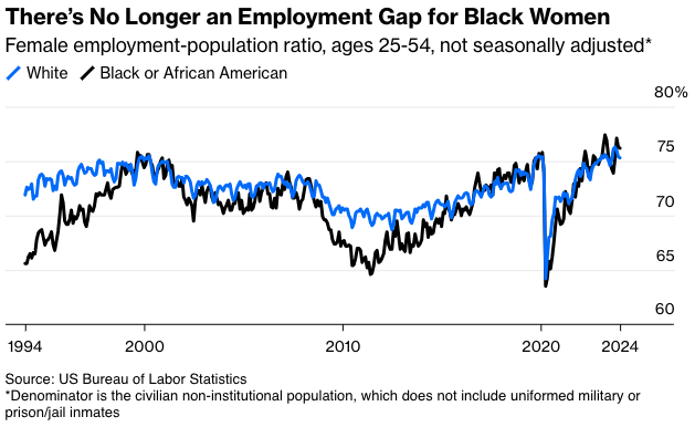
Black women still earn much less than White women, with the pay disparity greatest among younger women. Their labor force participation may to some extent be boosted by the fact that they’re less likely to be able to afford staying home to care for children or other relatives. A shrinking racial employment gap for men and a disappearing one for women are at least better than the alternative, though, and are pretty clear signs that Black Americans’ persistent disadvantage in income and wealth isn’t due to lack of effort.
What is the cause, then? One simple explanation is that disparities in income and wealth, especially the latter, tend to persist. A 2020 study by two Italian economists found that the richest families in Florence in 1427 were for the most part still on top in 2021. For Black Americans, there are the added burdens of centuries of government and private actions that prevented them from accumulating wealth or robbed them of it, plus continued if lessening racial discrimination in jobs, housing and other areas. How to make up for that? I don’t have a great answer, but it does look like what we’ve been doing for the past half-century probably isn’t it.
Justin Fox is a Bloomberg Opinion columnist covering business, economics and other topics involving charts. A former editorial director of the Harvard Business Review, he is author of The Myth of the Rational Market.