


As you may have heard, the U.S. inflation rate is 9.1%. That is, the consumer price index for all items as estimated for June by the Bureau of Labor Statistics was 9.1% higher than it was a year earlier.
Other economic indicators generally aren’t measured this way. With retail sales, it’s the percentage change from one month to the next that gets the headlines. With employment it’s the monthly change in the number of jobs. With gross domestic product, in the U.S. at least, it’s the annualized quarterly change .
In its monthly CPI news releases the BLS actually does mention the monthly percentage change—as in the change from May 2022 to June 2022—before the annual comparison to the same month a year earlier, but this tends to get a lot less attention, probably because it’s so much smaller (1.3% in June) and harder to make sense of. That’s easy enough to fix, though. Here’s what it looks like if we follow the GDP example and annualize the monthly CPI change. (Contrary to popular belief one does this not by multiplying the monthly percentage change by 12—although when percentage changes are small that gets one pretty close to the correct number—but by dividing the current-month CPI by the previous month’s, taking the result to the 12th power and subtracting one. [Or by adding one to the monthly percentage change, taking that to the 12 power and then subtracting one])
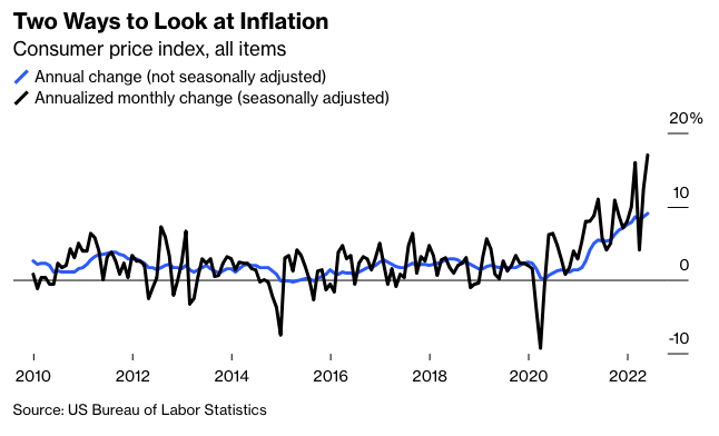
Measured this way, U.S. consumer prices rose at a 17.1% annualized pace in June. That’s awful! But it is also, as is clear from the chart, possibly not very informative. Monthly CPI changes are volatile, and annualizing them just makes them more so.
To get past the volatility, policy makers and market watchers often focus on so-called “core” inflation that excludes food and energy prices. It rose 0.7% in June. Annualized that comes to 8.8%, compared with a 5.9% year-over-year gain.
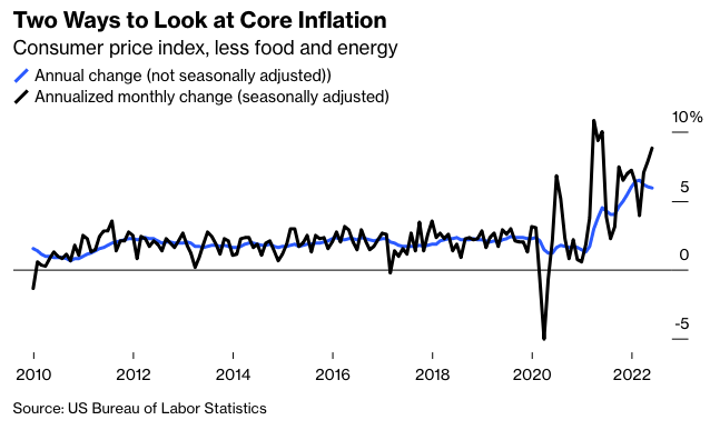
Measured year-over-year, core inflation has been steadily declining since March. Measured month-to-month, it has been accelerating since then. And yes, it’s pretty noisy, but smooth it by annualizing the three-month change and the picture of accelerating core inflation remains.
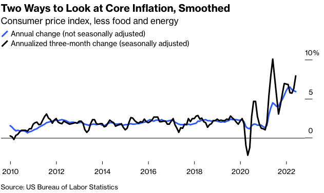
I’m pretty sure that the monthly and three-month core inflation measures better reflect what’s been going on in the U.S. economy over the past year than the annual change does. There was a spectacular burst of inflation last spring that subsequently subsided, only to be followed by new, smaller but still major waves—the latest of which certainly hasn’t crested yet in the CPI data.
For context, consider what the current GDP trajectory would look like if we measured it as we did inflation. Year-over-year GDP change will still be positive even if the Federal Reserve Bank of Atlanta’s current gloomy GDPNow forecast of a second quarter in a row of declining GDP comes to pass. (I’ve started the chart with the quarter ending December 2020 because the wild GDP swings of the previous two quarters would otherwise make it really hard to read.)