Eventually, down the line, bond yields may just rise, and equity valuations may also have to reset alongside yields. But, at this point, despite the risks and the high CAPE ratios, stock-market valuations may not be as absurd as some people think.
Shiller made his name with the public by denouncing the dot-com bubble, and later the housing bubble; he isn’t prepared to call this a bubble. Another phrase for what is now going on, which was popular a decade ago, was of a “rational bubble.” With rates so low, the argument goes, it was rational to pay silly money for stocks because there was a lack of alternatives.
But this leads to a question which Gerard Minack, of Minack Advisors, raises this week. Do low interest rates in their own right lead to higher earnings multiples? His answer is no; it’s not rational to bid up stocks just because rates are low. The reason is because not all else is equal. Usually interest rates are low because growth is bad, and when growth is bad that tends to be bad for equities. That leads to a curved relationship between rates and equities over time—when rates come down from very high levels, equity multiples tend to improve, but when rates then drop to very low levels, equity multiples fall because this generally means that the economy is mired in a recession.
The following chart maps the CAPE on one scale against the 10-year yield on the other for every month since 1925. An immediate look shows that the relationship between the two isn’t that strong. The best fit Minack can find, excluding the extraordinary dot-com years, has an R-squared of only 0.12, meaning only a weak correlation:
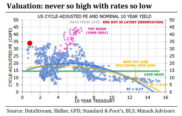
The dot-com bubble readings, shown in pink, are almost literally off the chart—exceptionally high multiples given the interest rates of the time. Meanwhile, the current reading, in bright red, is a tad alarming. This isn’t a well-explored end of the spectrum, obviously, but stocks do look expensive. In terms of Shiller’s logic, Minack is showing that we would expect the excess yield to rise as rates get to extreme lows. If the relationship with rates held as anticipated in his chart, then the excess yield as calculated by Shiller would be roughly double what it is now (and stocks, on Shiller’s suggested methodology, would look like a screaming buy).
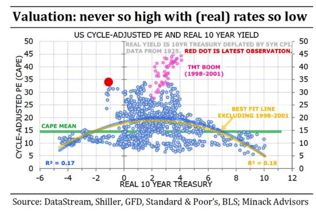
Minack then repeated the exercise for real yields, accounting for inflation. Real yields, compared to current inflation, are low at present, but not historically unprecedented. This exercise gives a slightly better correlation (although only slightly), makes the dot-com bubble look like more of an outlier and, sadly, also makes the current point look like more of an outlier. There have been a number of observations with 10-year nominal yields below the rate of inflation in the past, and this is the most expensive that stocks have ever been during such a period:
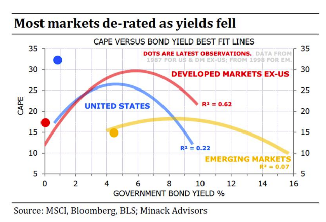
To be clear, Minack isn’t saying that all stock markets show up as an historical outlier, just the U.S. This chart, using nominal yields since 1987, compares CAPEs and 10-year yields for developed markets outside the U.S., emerging markets, and the U.S. Outside the U.S., stocks appear to be reasonably valued given the level of interest rates. U.S. stocks look wildly overpriced: