


The yield curve spread dropped a bit further in July, taking it to a new post-crisis low. It is still well outside the trouble zone, so the immediate risk remains low. But the fact that the spread is at a new low, in combination with the Fed’s expected rate increases, suggests that this remains something to watch. I am leaving this measure at a green light for now, but you can see a shade of yellow.
Signal: Green light (with a shade of yellow)
Market Risk
Beyond the economy, we can also learn quite a bit by examining the market itself. For our purposes, two things are important:
1. To recognize what factors signal high risk
2.To try to determine when those factors signal that risk has become an immediate, rather than theoretical, concern
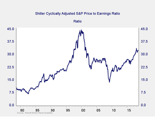
Risk factor #1: Valuation levels. When it comes to assessing valuations, I find longer-term metrics—particularly the cyclically adjusted Shiller P/E ratio, which looks at average earnings over the past 10 years—to be the most useful in determining overall risk.
The major takeaway from this chart is that valuations remain extremely high. In fact, they are close to the second-highest level of all time, exceeded only by the dot-com boom. Also worth noting, however, is the very limited effect on valuations of the recent increases in earnings due to the tax cuts. On a shorter-term basis, those earnings increases have markedly reduced valuations, suggesting reduced risk. On a longer-term basis, however, as shown in the chart above, valuations have not pulled back much at all. High valuations are associated with higher market risk—and longer-term metrics have more predictive power. So, this is definitely a sign of high-risk levels.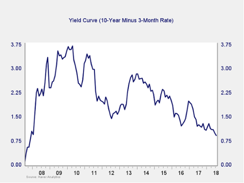
Monthly Market Risk Update: August 2018
August 10, 2018
« Previous Article
| Next Article »
Login in order to post a comment