What Went Up And What Went Down?
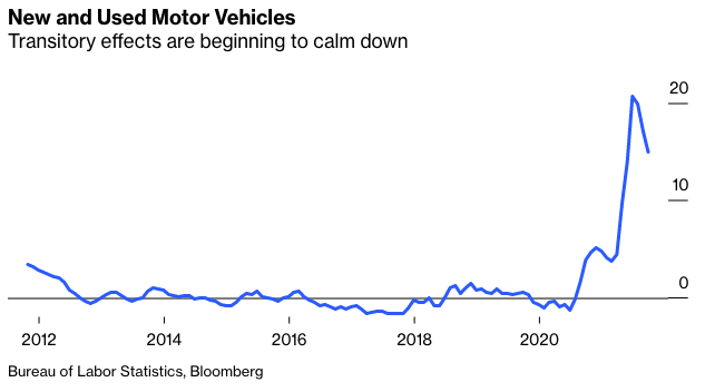
The Bureau of Labor Statistics publishes all the data that go into calculating their numbers, and this year we have all started to look at them much more carefully. If we look at some of the sectors most affected by Covid, we can see the extreme effects fading away. This is inflation in new and used motor vehicles:
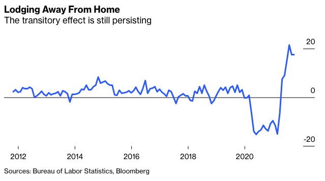
But some of the sectors that took a knock from the pandemic are taking a little longer to return to normal. Hotel inflation still looks high on a 12-month view. There are still some transitory effects that will drop out of the calculation in the months ahead:
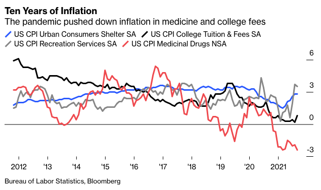
There are other sectors where prices have been reduced by the pandemic. The following chart shows inflation over the last 10 years for four CPI components that we include in the regular inflation indicators. Medicine prices are actually falling, and college tuition fees inflation is historically low (although annoyingly it has started to rise again). Recreation services prices, which might be expected to rise as we reopen after the pandemic, are inflating at more than 3%, but the effect is not extreme.
The critical measure for the next few months is for shelter inflation. It is still well within its normal range, but the rise in employment and in house prices over the last year means that it is very, very likely to rise from here.
The overall picture, then, is that different components are behaving much as might be expected, with the most extreme effects dampening but inflation spreading. We can now analyze this in more detail.
Yes, ECAN
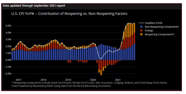
Bloomberg has produced a great new tool that those with access to a Terminal can play with by typing in ECAN <GO>. It makes it easy to break down the factors in inflation data (and lots of other economic data). To start with, this is how the year-on-year increase in headline inflation can be broken down between energy, components affected by reopening, and components not affected by reopening: