A Closer Look At The Boom Years
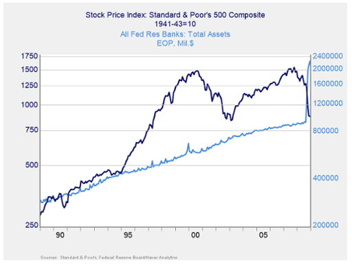
If we take a closer look at the boom years, though, we see that from the late 1990s to 2007, the stock market’s growth stayed well above that of the Fed’s balance sheet. While the Fed kept expanding its holdings in line with the economy, the stock market was growing much faster as valuations kept going higher. The connection of earlier decades was clearly broken. That changed again in 2008–2009, as the stock market collapsed, bringing it back closer to the Fed’s asset base. Based on history, the post-2008 stock market returned to where it should have been.
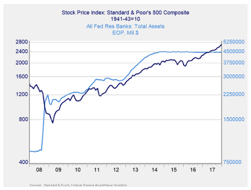
Given the financial and economic damage the crisis caused, however, and as we stated at the start, the Fed decided to force rates down using QE—buying bonds and expanding its balance sheet. You can see how that spiked in the chart below.
Will The Stock Market Follow The Fed Balance Sheet?
In the next chart, you can see that, once again, when the Fed pushed its balance sheet up, we saw a match between the growth of the Fed’s balance sheet and that of the stock market. Per history, this is something we could have expected. The problem is the jump in Fed assets that took place with the QE programs. The Fed’s holdings are now much greater, in proportion to the economy, than they have been. The QT program is designed to restore that balance. The question is whether the stock market will then follow the Fed balances down.