


The fact is that looking at data is an art, not a science. There’s no single process, no single toolkit for success. It requires years of practice on top of an innate artist’s eye before you have a chance of being good at this, and it’s something that I’ve never seen a non-human intelligence accomplish successfully (I can’t tell you how happy I am to write that sentence). But just because it’s hard, just because it doesn’t come easily or naturally to people and machines alike … well, that doesn’t mean it’s not the most important thing in data-based truth-seeking.
Why is it so important to SEE data relationships? Because we’re human beings. Because we are biologically evolved and culturally trained to process information in this manner. Because — and this is the Tufte-inspired market axiom that I can’t emphasize strongly enough — the only investable ideas are visible ideas. If you can’t physically see it in the data, then it will never move you strongly enough to overcome the pleasant fictions that dominate our workaday lives, what Faust’s Tempter, the demon Mephistopheles, calls the “masquerade” and “the dance of mind.” Our similarity to Faust (who was a really smart guy, a man of Science with a capital S) is not that the Devil may soon pay us a visit and tempt us with all manner of magical wonders, but that we have already succumbed to the blandishments of easy answers and magical thinking. I mean, don’t get me started on Part Two, Act 1 of Goethe’s magnum opus, where the Devil introduces massive quantities of paper money to encourage inflationary pressures under a false promise of recovery in the real economy. No, I’m not making this up. That is the actual, non-allegorical plot of one of the best, smartest books in human history, now almost 200 years old.
So what I’m going to ask of you, dear reader, is to look at some pictures of market data, with the hope that seeing will indeed spark believing. Not as a temptation, but as a talisman against the same. Because when I tell you that the statistical correlation between the US dollar and the price of oil since Janet Yellen and Mario Draghi launched competitive monetary policies in mid-June of 2014 is -0.96 I can hear the yawns. I can also hear my own brain start to pose negative questions, because I’ve experienced way too many instances of statistical “evidence” that, like the Anscombe data sets, proved to be misleading at best. But when I show you what that correlation looks like …
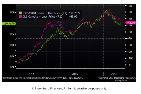
I can hear you lean forward in your seat. I can hear my own brain start to whir with positive questions and ideas about how to explore this data further. This is what a -96% correlation looks like.
What you’re looking at in the green line is the Fed’s favored measure of what the US dollar buys around the world. It’s an index where the components are the exchange rates of all the US trading partners (hence a “broad dollar” index) and where the individual components are proportionally magnified/minimized by the size of that trading relationship (hence a “trade-weighted” index). That index is measured by the left hand vertical axis, starting with a value of about 102 on June 18, 2014 when Janet Yellen announced a tightening bias for US monetary policy and a renewed focus on the full employment half of the Fed’s dual mandate, peaking in late January and declining to a current value of about 119 as first Japan and Europe called off the negative rate dogs (making their currencies go up against the dollar) and then Yellen completely back-tracked on raising rates this year (making the dollar go down against all currencies). Monetary policy divergence with a hawkish Fed and a dovish rest-of-world makes the dollar go up. Monetary policy convergence with everyone a dove makes the dollar go down.
What you’re looking at in the magenta line is the upside-down price of West Texas Intermediate crude oil over the same time span, as measured by the right hand vertical axis. So on June 18, 2014 the spot price of WTI crude oil was over $100/barrel. That bottomed in the high $20s just as the trade-weighted broad dollar index peaked this year, and it’s been roaring back higher (lower in the inverse depiction) ever since. Now correlation may not imply causation, but as Ed Tufte is fond of saying, it’s a mighty big hint. I can SEE the consistent relationship between change in the dollar and change in oil prices, and that makes for a coherent, believable story about a causal relationship between monetary policy and oil prices.