It’s arguable that your website is your most valuable brand asset. It gives you valuable marketing real estate to vie for clients’ attention. On a client’s laptop, your home page gets the same screen space as that of any financial giant.
Despite the time and energy you might have spent designing your ideal office experience, it’s likely that most of your prospects will never walk through your office’s front door. Instead, their first experience with you has shifted to their encounter online, and to the website that every one of them will visit. So it’s critical to make the experience count.
This article provides a checklist of best practices that can help ensure you create an impressive first impression.
1. Follow The Five-Second Rule
Just over half of website visitors spend less than 15 seconds on a page before leaving. To keep visitors around, your home page needs to provide enough information to help visitors decide as quickly as possible that they are in the right place.
That’s where the five-second rule comes in. It’s a quick test to see how effective your home page is. Here’s how you can do it:
1. Navigate to your website’s home page.
2. Without scrolling or clicking, give yourself time to take everything in.
3. Then, see how many of the following questions you can answer:
a. Who benefits from your services?
b. What makes your firm different from others?
c. What’s your visitor’s next step?
If your page can’t answer these questions within five seconds, then you should make some edits.
Most of the five-second rule’s questions can be answered by your “hero message” (the statement at the top of your page) and by your call to action, the next step you’re asking the reader to take. So start editing there.
Be as specific as possible, without overwriting. Show whom you work with, and what makes you different, then use other elements to support this message.
WealthKeel’s website provides a great example, opening with a specific hero message and supporting it through imagery:

2. Design Your Page For First-Time Visitors
The goal of your site is to attract and convert leads. Therefore, it should be friendly to current clients but designed for first-time visitors.
To edit your site for first-time visitors, ask yourself these things:
• Is your website easy to navigate? Is your menu clear and not overly complex?
• How are you showcasing your expertise? Do you have a blog or newsletter?
• Can visitors locate and understand your fee structure?
• Are your services clearly defined and organized?
• Do you have an “about” page providing a background for your firm?
• How can visitors contact you? Is this information easy to find?
Start with your menu, which is the best place to begin since it will often help you organize where your other information should go.
And as a bonus tip, consider including two calls to action on your home page—one for visitors who are ready to contact you and another for those who want to learn more.
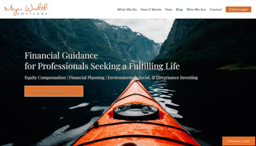
The Meyer Wealth Advisors site is a great example of these ideas in action, offering a clear menu and two calls to action to drive visitor engagement.


