


The yield curve spread tightened a bit in March, taking it back toward the post-crisis low in December. But it is still well outside the trouble zone, and the immediate risk remains low. The fact that the spread has tightened again, in combination with the Fed's expected rate increases, suggests that this remains something to watch. I am leaving this measure at a green light for now, but you can see a shade of yellow.
Signal: Green light (with a shade of yellow)
Market risk
Beyond the economy, we can also learn quite a bit by examining the market itself. For our purposes, two things are important:
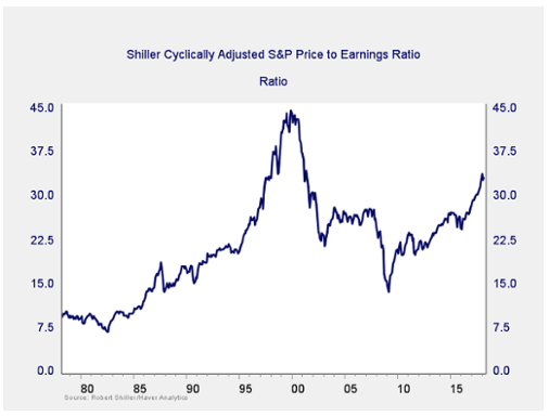
Risk factor #1: Valuation levels. When it comes to assessing valuations, I find longer-term metrics—particularly the cyclically adjusted Shiller P/E ratio, which looks at average earnings over the past 10 years—to be the most useful in determining overall risk.
The chart above is interesting for a few reasons. Since the presidential election more than a year ago, equity valuations have increased to levels not seen since the early 2000s. In addition, gains this year have pushed valuations even higher, to the second-highest level of all time. Right now, they are below only 1999, as you can see from the chart.
Despite the recent pullback, valuations remain high—notice that the recent volatility looks quite small on the chart. So, as bad as it feels, it was perfectly normal in historical terms. This illustrates, once again, the importance of keeping a big-picture perspective and looking at individual events in a historical context.
The Shiller P/E ratio is a good risk indicator (and with valuations high, so is the risk), but it’s a terrible timing indicator. One way to remedy that is to look at changes in valuation levels over time instead of absolute levels.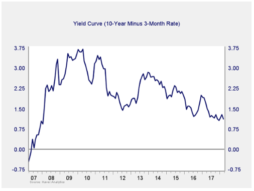
Market Risk Update: April 2018
April 13, 2018
« Previous Article
| Next Article »
Login in order to post a comment