


Part 2: Recognizing A Failing Withdrawal Plan
To explore the usefulness of the current withdrawal rate as a “red flag,” consider Figures 3 and 4, which track the rate over the first 10 years for a substantial number of historical retirement portfolios. I have set the initial withdrawal rate at 6.0%, well above “SAFEMAX,” to ensure that there will be a significant number of failed portfolios within the 30-year time horizon.
Of the 241 retirement portfolios in my sample, 56 failed in less than 30 years. Figure 3 displays the current withdrawal rate curve for each of the 56 failed portfolios. Quite frankly, this is a disappointing chart. All portfolios begin at the left of the chart with an initial withdrawal rate of 6.0%. However, after 10 years, the current withdrawal rates exhibit a very wide spread, ranging from just above the original 6% to over 20%. In between, the performances of the current withdrawal rates appear chaotic, with some portfolios rising initially, some falling, and some enduring a lot of ups and downs in between.
Similarly, Figure 4 displays the current withdrawal rate curve for each of 56 “successful” portfolios (those that lasted the full 30 years or longer). There were actually 185 successful portfolios, but I chose 56 representative ones for the chart to avoid clutter.
This chart is almost equally confusing. No clear patterns emerge. There are quite a few portfolios whose current withdrawal rates rose above 8% in the early years and a few whose rates rose above 10%. This would normally be a signal for concern. Yet every one of the portfolios, as their inclusion here demonstrates, recovered and lasted at least 30 years.
Taking the two charts together, there are a number of failed portfolios that attained a current withdrawal rate of 8% or greater in the five-year range, and a number of successful portfolios as well. It doesn’t appear to me that the current withdrawal rate alone has a reliable predictive value for a portfolio’s eventual success or failure. By itself, it’s an ambiguous measure over the first 10 years.
Incorporating Inflation
That doesn’t necessarily mean the measure is valueless. In fact, it sounds an alarm that something may be amiss. But we need corroborating evidence for failure, and for that I suggest comparing the current withdrawal rate chart for your client’s portfolio with the appropriate “stressed-portfolio” current withdrawal rate charts we developed in Part 1. The idea is that if your client’s current withdrawal rate curve stays below the “worst-case” current withdrawal rate chart, it should survive for 30 years. Of course, one must be sure to use the correct inflation regime chart.
For example, let’s say you believe yourself to be in a moderate inflation environment. Your client’s current withdrawal rate in year five of his retirement is 9.22%. Figure 1 shows a current withdrawal rate of 8.1% (for the 1936 moderate-inflation investor). Clearly, your client’s portfolio is performing worse than the “worst-case” standard for this environment. There may be two explanations for this: Either the client adopted an initial withdrawal rate higher than the “SAFEMAX” for the moderate-inflation environment (5.3%), and is paying a price for his aggressiveness, or he has unluckily encountered a worse-than-worst-case environment. The latter may be a new, lower “SAFEMAX” in the making. In either case, an adjustment is suggested, or the portfolio may expire prematurely.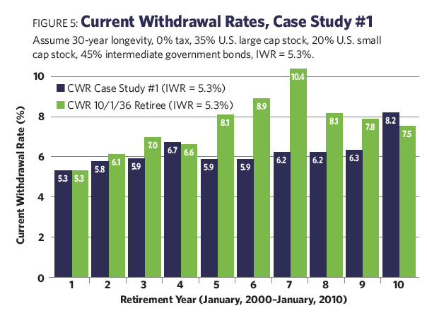
Fixing A Broken Retirement Withdrawal Plan
December 1, 2017
« Previous Article
| Next Article »
Login in order to post a comment
Comments
-
Once again, a hugely important contribution. Thanks Bill! Way too much emphasis is being placed on sequence of return, when it is, as Bill demonstrates here, inflation that poses the far greater threat to a retirees prospects. When explaining "the 4% rule" to clients, to classes, or at presentations, I always ask what year they would think would have been the worst to retire in and almost everyone says 1929 - but, of course, it wasn't. The impact of downturns is quickly reversed as long as the market recovers, while the impact of inflation (absent a period of deflation) only compounds.