


Six months ago, many were urging observers to focus on the trimmed mean, on the assumption it would reveal that high headline rates were driven only by a few extreme sectors. Instead, it is showing that inflationary pressure is steadily broadening.
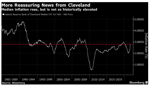
For a more positive measure, try the median level of inflation, also produced by the Cleveland Fed. Over history, it has tended to move with the trimmed mean, but not recently. It is also rising sharply, but compared to its own history it is not at a level to cause any great concern:
Play around with the data, then, and you make the current rate of inflation look less terrifying. It still looks like the worst price spike in more than a decade, and the measures of core inflation are catching up with the headline.
What About Base Effects?
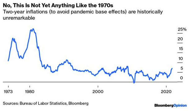
There is an argument that this is all about base effects. Last year saw an epic sudden stop for the economy, along with a collapse in oil prices. Of course inflation will look high 12 months after those events.
Using brute force and ignorance, we can counter this effect by looking at the 24-month inflation rate over time, rather than the 12-month inflation rate. This exercise shows that inflation is indeed rising at present, but it is nothing remotely like what the U.S. experienced in the 1970s:
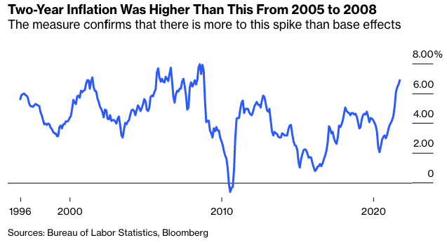
As the 1970s make it hard to see what is happening more recently on that chart, here is the same exercise for the last 25 years. This demonstrates (1) that there is more to this spike than base effects but (2) 24-month inflation is still lower than it was for most of a three-year period before the financial crisis, from 2005 to 2008:
If this were purely transitory, the bump in inflation would disappear once we took a longer period. It isn’t purely transitory, and it's clearly the worst inflation since the global financial crisis. But taking the longer period makes this incident look less severe.