


Transitory Fun In The Twitterverse
I don't think it makes sense to call this inflation “transitory,” although I hope it’s also clear that comparisons to the 1970s are wildly disproportionate. On Twitter, however, the debate continues. The following chart appeared on Twitter, along with the message “Team transitory won btw.” It triggered heated debate:
I don’t remember anyone telling me to keep an eye on the two-month annualized percentage change in core CPI, but maybe this measure is of interest. Twitter has some expert chartists who know exactly how to lie with statistics, however.
One contribution was to suggest that core inflation needed to return to its trend line of 2% per year. It has departed from it in the last year:
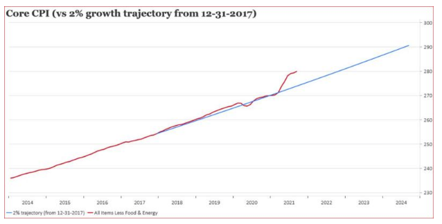
But there’s always fun to be had with changing the time scale on the X axis. Take the same chart back two decades, and we find that this episode still leaves inflation below a 2% per annum trend:
Inflation in prices has been very low for a very long time, and that needs to be kept in mind. It’s possible we are witnessing a jolt out of a deflationary era that had lasted a quarter of a century. But for the time being, the era of stable prices continues.
What Next?
On the latter, Chile provided an uncomfortable reminder that when inflation gets above a central bank’s target, it responds by hiking rates. Chile’s central bank raised its base rate by 125 bps in a bid to rein in a dose of inflation that hit just after the country saw a wave of protests over the high cost of living: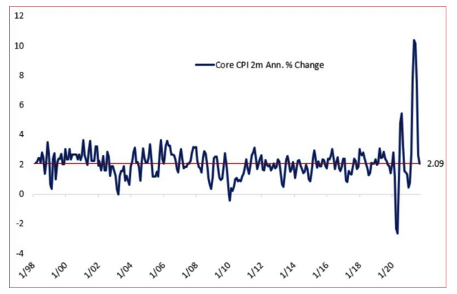
The key questions for investors arising from this are: What should we do about it, and what should we expect central banks to do about it?