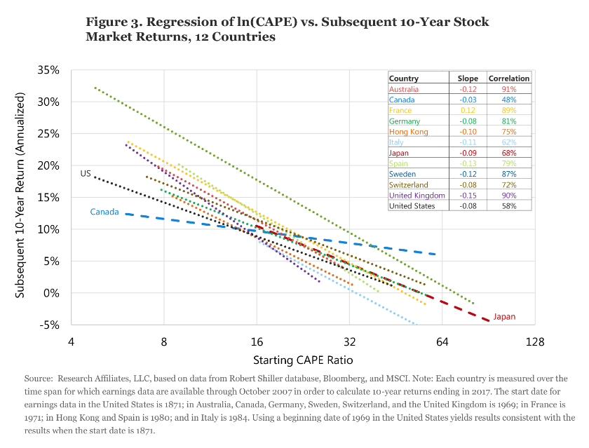
Figure 3, which expands our analysis beyond the US market, offers a different perspective on the efficacy of the CAPE ratio. We produced scatter plots—much like the graphs in Figure 2—comparing the starting CAPEs of 12 developed stock markets and the markets’ respective 10-year returns. Figure 3 leaves out the cloud of plot points, but shows the regression line for each of these countries. With the exception of Canada, they all bear a remarkable resemblance. Canada may not necessarily be “different”; it may simply be a random outlier that we would find in any distribution. The average slope of the 12 regression lines is −0.08, meaning that for each 1 percent increase in CAPE, the annualized return over the next 10 years falls by 8 basis points (bps). Put a different way, a move from 20 to 21, a 5 percent increase, lowers the total 10-year expected return by 4 percent.
Cape Skeptics’ Arguments
Comparing the CAPE ratio from 1960 to today is like comparing Oscar Robertson to Russell Westbrook. Same game, but things have changed.
—Michael Batnick, CIO, Ritholtz Wealth Management (2017)
As Jeremy Grantham and other investors have pointed out, over the last quarter-century the US CAPE ratio has remained unusually high relative to history. As a result, CAPE zealots have missed much of the bull markets of the 1990s, 2002–2007, and 2009–2017. Given the popularity of CAPE, many observers have suggested new ways to interpret the measure, and some have offered adjustments that ostensibly help CAPE serve as a better gauge of value. Others suggest that we disregard CAPE entirely—CAPE fear, indeed!
Several possible explanations for a sustained elevation in CAPE ratios include:
• Structural changes in earnings per share (EPS) growth. Higher structural growth in EPS justifies a higher equilibrium CAPE ratio. Grantham (2017) makes this argument.
• Demographics. A soaring roster of working adults approaching retirement age can become valuation-indifferent buyers of financial assets in order to have future resources to buy goods and services in retirement. We have made this argument (Arnott and Chaves, 2012 and 2013).
• Real interest rates. Low real interest rates can mean a lower discount rate, providing higher valuations for any risk-bearing financial assets, unless those low real interest rates are also predicting abnormally slow earnings growth.
• Risk in macroeconomic measures and in financial assets. The volatility of financial assets is at near-record lows, as is the volatility of the macroeconomy when measured by the volatility in gross domestic product (GDP) and in CPI inflation. If risks are lower, then the risk premium should be smaller. A lower risk premium means a lower discount rate, which means higher valuation levels.